it’s MARKER GEEK MONDAY!

Time for another dose of the best antidote for Monday: Marker Geek Monday! Let’s get colourful together and forget what day it is. 😉


Today I thought I’d talk a little about something a little less glamorous, but in my opinion totally essential in your colouring toolkit: COLOUR CHARTS!


A hand coloured chart is invaluable in both keeping track of your collection and when you are selecting colours to use for a project.


There are some different options out there. These are the two I use.


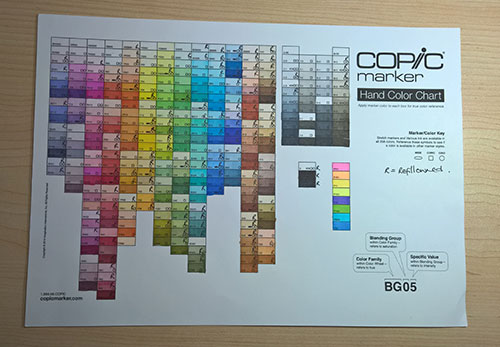
  1. Copic Colour Chart – this is available as a free download HERE on the US Copic Distributor’s website. The chart is arranged in numerical order, by colour family. This chart is perfect for keeping track of your markers. As you can see I also use it to track my refills by marking the colours I own refills for with a little “R” in the corner. Because the chart is arranged in numerical order it is easy to find the colour you are looking for and see where any gaps are.


2016_05_30_markergeekmonday_copiccolourchart


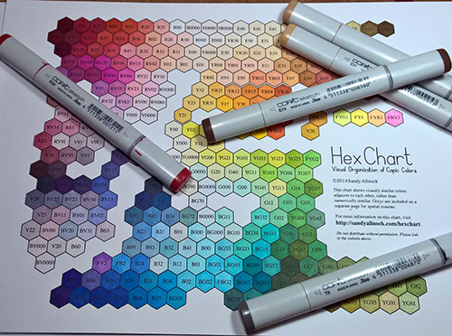
  1. The Hex Chart by Sandy Allnock – this is available HERE on Sandy’s website. The Hex Chart is not free, but at $5.99 it is a relatively inexpensive tool which I personally use on a daily basis. This chart is a completely different animal to the Copic Colour Chart above, as it organises the colours visually. This presentation of colours is incredibly useful for a number of reasons.


 2016_05_30_markergeekmonday_hexchart


As I mentioned above, the Copic Colour Chart is a useful way to keep track of your collection, and it was the only chart I used for a number of years. I keep a copy in my folder, which these days mostly serves as a record of which refills I already own, so I can avoid duplicating any purchases! Previously it served a similar purpose for the markers themselves. I no longer use the chart for selecting colours.


When the Hex Chart came into my life, it was a game changer! I have always enjoyed playing with mixing colours from different families and this chart makes that process a lot easier.


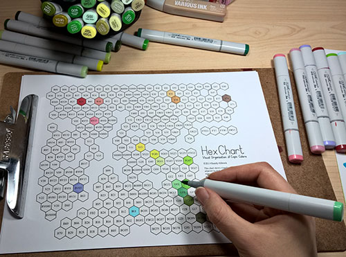
You may be thinking “I don’t have enough markers to make use of the Hex Chart yet”. I’d advise that actually, you’re in the PERFECT position to take full advantage of Sandy’s hard work. Included in the zip file you receive are both a black and white hand colour chart and also a scanned coloured version.


The coloured version of the chart is a great reference tool to aid you in deciding which markers to add to your collection. You can get a good impression of which colours will work well together, and perhaps more importantly you can see which markers you don’t need at all because they are so similar to others. For those of us with a complete or near complete collection this aspect is useful when we have a marker that needs refilling – if we don’t have the refill for that particular marker we can reference the chart to see if there are any good substitutes so we can keep colouring.


Note: the coloured version of the Hex Chart is not guaranteed to have 100% colour accuracy due to the nature of digital reproduction and if printed out, variation in individual printer calibration. With this in mind, it is still a very useful reference.


Due to the limited lightfastness of Copic Markers (this is variable – some colours will fade more than others), it is a worthwhile task to colour a new version after a period of time. I’d suggest perhaps once a year. Having a relatively fresh version of your colour charts will ensure that you are seeing as accurate a representation of the colours as possible.


 2016_05_30_markergeekmonday_hexchart_refresh


Periodically renewing your colour charts also provides an ideal opportunity for doing some marker maintenance. While you’re colouring your chart you might notice markers which need refilling or markers in need of some cleaning and maybe nib changes. Make sure you grab your beverage of choice and pop on something in the background to keep you entertained!


I hope you have a fantastic week filled with colour! Share your colour chart experiences and thoughts with us in the comments below or share pics over on Instagram using #markergeekmonday . Don’t be shy, we want to hear from you all!


MWAH!


Elaineabella


Disclaimer: I was not asked to write this post by Sandy Allnock, although I was provided with a copy of the Hex Chart to participate in her April 2015 blog hop. I have been using the Hex Chart since that time, every time I colour with Copics. All opinions are my own.


it’s MARKER GEEK MONDAY!!

Monday again! Seriously, I’m getting a little freaked out about the pace at which these Mondays are coming around. Somebody stop the ride, I want to get off for a minute!


If you’re joining us for the first time you may want to check out the previous Marker Geek Monday posts HERE.


This week I’ve got a little video for you. You can watch me colour one of our recent releases, the lovable and totally squishable EDNA. She’s got her own section on the website, because y’know, she’s a bit of a diva. 😉 Today’s image is MEET EDNA.

Here’s a bonus colour map so you can colour along! (See HERE for instructions on obtaining the main colour maps for Stamping Bella images.)


2016_stampingbella_meetedna_web_copic_colourmap


I used one of my “go to” hair colour combos, which you can find in this post HERE along with a few others!


For past Stamping Bella colouring videos, you can check out this THIS PLAYLIST over on my Marker Geek Youtube Channel!


Have a fantastic, colourful week. Remember to experiment, then pop back and share your results here with us on the blog or over on Instagram using #markergeekmonday ! We love to hear from you, so don’t be shy.


MWAH!


~Elaineabella

it’s MARKER GEEK MONDAY!

Time for another Marker Geek Monday! Hopefully a splash of colour will help banish the Monday blues. 😉


If you’re joining us for the first time you may want to check out the previous Marker Geek Monday posts HERE.


This week I’d like to encourage you to play with your markers (or other colouring mediums) and see how you can achieve variety and interest in your colouring with a limited palette.


2016_05_16_stampingbella_instagram_moniquelovesmacarons


As you can see, I’ve been having fun with MONIQUE LOVES MACARONS, one of the fun Stamping Bella Uptown Girl images. This one is perfect for testing out how using markers from one main “combo” in different ways can create different results. On each stamped image I have taken one main Copic combo and used markers from it on each macaron to create an attractive, eye-catching stack.


I’d also like to remind you that your results with the same combos are likely to be different. The look you achieve with your markers will vary depending on how heavily you apply the ink, how much you layer, the order in which you use the markers in a combo, the paper you use etc. This is the beauty of Copic markers – you can build a great deal of depth and variety of colour with quite a limited selection of markers. So, if your collection is still in the early stages, or you are just about to get started, don’t be disheartened! You can have a lot of fun with less markers than you might think. 😉


If you don’t have the colours I’ve used, grab a combo of markers you do have and try something similar with those.


Top Tips:

  • If there is a big gap between some of your markers (or they just don’t blend nicely), like Y11 and YR23 in my examples below, use the “tip to tip” blending method to help blend. This technique involves picking up some of the ink from your darker marker on the nib of the lighter marker, and using that as your mid-tone to blend on the paper. You can either pick the ink up directly from the marker nib, or scribble some ink onto an acrylic block first.
  • If you have difficulty creating the depth you would like in shadow areas, use your greys to help out (see HERE for some tips on greys).


2016_stampingbella_limitedmarkers_colourmap_monique_loves_macarons_bluegreen_web 2016_stampingbella_limitedmarkers_colourmap_monique_loves_macarons_blueviolet_web 2016_stampingbella_limitedmarkers_colourmap_monique_loves_macarons_pink_web 2016_stampingbella_limitedmarkers_colourmap_monique_loves_macarons_yellow_web


There’s something quite satisfying about seeing all those colourful macaron stacks! Another great image to play with would be the MACARON BOUQUET stamp.


Have a fantastic, colourful week. Remember to experiment, then pop back and share your results here with us on the blog or over on Instagram using #markergeekmonday ! We love to hear from you, so don’t be shy.


MWAH!


~Elaineabella

it’s MARKER GEEK MONDAY!

It’s Monday again, in case you hadn’t noticed! If like me you’re a little stressed by the rapid pace at which the weeks are whizzing by, take a little time to lose yourself in colouring. It won’t slow time down, but it does help reduce stress!


If you’re joining us for the first time you may want to check out the previous Marker Geek Monday posts HERE.


This week we’re back to Copic Markers, and this post is packed with colour combos and tips, so grab a cup of your preferred beverage and settle in! Make sure you read right to the end to grab a bonus colour map for the Stamping Bella Cherry Chick stamp!


Many people complain about colouring with reds, and I’ll admit that they can be tricky. I love colouring reds and maybe that’s because they can be a little challenging. One of the problems you might be experiencing with reds is achieving a nice blend while maintaining depth and contrast. This is where shading with other colours can really help.


In the chart below you will see that I have taken one of my favourite Copic red combos and added shading with markers from other colour families.


copicredshadingMAY9


The cherry image used in my chart above comes as a separate stamp included with the CHERRY CHICK rubber stamp set.

You can see a similar chart over on my own blog HERE which also has a couple of other base red combos.

For more colour combos for the Cool Chicks check out my previous Marker Geek Monday post HERE.


Copic Reds – General Colouring Tips:

These tips may help if you’re having problems colouring with reds or other rich colours. They aren’t hard and fast rules, but may assist you in “troubleshooting”.

  • Use a light touch: when colouring with markers in general (and most media) I find it best to use a light hand, and this is definitely the case when colouring with reds and other richly pigmented colours. If you are heavy handed and lay down too much colour at once blending becomes more difficult, and in laying down even more ink to blend you will run in to problems with the ink bleeding over the lines. Use a light touch and lots of layering.
  • Feather/flick: rather than colouring in circles, lay colour down with a flicking/feathering motion. Don’t try to soak the paper evenly.
  • Save reds till the end: if you plan on colouring other surrounding parts of your image in lighter colours, colour those areas first so that you can avoid accidentally pulling reds in to areas you don’t want them. At the same time, you may want to allow the lighter areas to dry completely before starting to colour the reds to avoid the red ink travelling into those areas.
  • Avoid the lines: if you experience issues with reds bleeding over the lines even when using a lighter touch, try not colouring right up to the lines of your image. This will give the ink a “buffer zone” to move in.
  • Don’t fuss with small areas: avoid trying to blend too much in small detail areas, it is almost guaranteed to end in a mess. You can get away without achieving a smooth blend in many small detail areas and avoid a headache in the process.
  • Try a different paper: if you are having real difficulties working with reds, you may want to try out some different papers. Softer more absorbent papers will tend to bleed more.
  • Adjust your colours: if you are having to lay down a lot of ink to blend your chosen colours, you might find tweaking the colour combo helps. Test out some alternatives and see if they play together better. The more ink you are having to lay down to achieve a reasonable blend, the more likely you are to experience issues with bleeding.

I work by adding a base layer of my lightest red shade, then using my shadow colour to lay down the shading followed by my darkest red shade, then the medium red and back to the lightest red again (I usually repeat the last two steps until I am happy). I use a light hand with each layer, and I try not to go over the darkest areas too much. In very small areas you may wish to start with your darkest shade and work backwards (I talked about this in my hair combos post HERE).

While I was colouring cherries I decided to colour up the entire CHERRY CHICK image again. Love this stamp set, it is perfect for some really fun summer cards and projects, and it presents a great opportunity to play with RED and really get some practice in! Here’s a bonus colour map for you (see HERE for instructions on obtaining the main colour maps for Stamping Bella images).


cherrychickCOLORMAP


Have a fantastic, colourful week!


MWAH!


~Elaineabella

It’s MARKER GEEK MONDAY!

Thank you for joining me again for another colourful start to the week! If you’re just joining us you may want to check out the previous Marker Geek Monday posts HERE.


Today’s post will be the last pencil related one for a little while. My markers are starting to sulk! If pencils are your thing though, don’t worry, I will be mixing things up again soon. 😉


As promised last week, today I am exploring a more budget-friendly option for colouring with pencils. Perhaps you’re just starting out (or know someone who is) and want to try out the medium before making a larger investment, or perhaps you want a cheaper option for colouring on the go when travelling etc, or like me you have a problem with collecting colouring mediums. This post is for you!


Like me, many of you probably grew up with the Crayola brand. Coloured pencils, crayons, markers, novelty stamping markers etc. If you have children, they probably have a pack or two in their art supplies. It is easy to dismiss them as “for kids” and as such “limited”. Fact is, you can achieve some great results with cheap art supplies. It is definitely nice to have the expensive professional quality stuff, and there are definite advantages, but for colouring stamped images you can get a lot of mileage out of cheaper brands. Don’t feel that because you can’t or don’t want to afford the high end supplies that you can’t have fun or create beautiful coloured images. You can.

2016_stampingbella_marker_colouring_budget_crayola_pencils_petunia_pig_chicks_001


In the first example I limited myself to using colours from the 24 pack of Crayola coloured pencils. You can pick these up for around £3 to £5 here in the UK, and from a quick look on Amazon around $5 in the US. In the second and third examples I used pencils from the 50 pack.


I used Zest-It Pencil Blend as a solvent to blend together with blending stumps. Zest-It is an alternative to odourless mineral spirits like Gamsol.


Petunia and the Cool Chicks look pretty good, right? You can see how they look in Prismacolor and Polychromos pencils in last week’s post. The stamp is called “Nice to See You Petunia” and is available along with more Petunia Pig stamps and other adorable creatures in the Woodsies range at Stamping Bella. The “Cool Chicks” have their own section in the store, although they are becoming known for popping up all over the place to make us laugh.


As much as I love my more expensive art supplies, I think it’s also great to try and work with cheaper and more readily available alternatives (it’s also a fun challenge). The fact is, people receiving your cards aren’t likely to notice the difference, and they won’t care that you spent $5 to $10 on pencils rather than $200. The pencils don’t make the magic, you do!


MWAH!


~Elaineabella

It’s MARKER GEEK MONDAY !

Thank you for joining me again for another colourful start to the week! If you missed my first pencil related post last week, make sure you check it out HERE to see some tips on using your coloured pencils together with alcohol based markers.


Today I’ve got a little 2-for-1: Stamping Bella’s adorable and fun Nice to See You Petunia stamp coloured using two different popular coloured pencil brands. I chose this image so you would get some colour combo ideas for both Petunia Pig and the Cool Chicks (they honestly pop up everywhere, getting into mischief) whether you’re a Prismacolor or Polychromos lover! You can find this stamp in the Woodsies section on the Stamping Bella website, along with more Petunia Pig images and some other A.D.O.R.A.B.L.E animals.


If you’re a devoted Copic user you may want to refer to the following posts for colour combos:


april25


Prismacolor Pencils Vs Polychromos Pencils


The main difference between the two brands is that Prismacolor pencils are wax based and Polychromos pencils are oil based. Polychromos pencils will not build up a wax bloom and so can be layered more than the Prismacolors. This is probably more evident if you are colouring larger detailed pieces with lots of layering.


As I mentioned in last week’s post, my first attempts in the wonderful world of colouring were made with Prismacolor pencils. I was gifted a full set around nine years ago, and I still have that same set (ditching them for markers does increase the lifespan of your pencils significantly 😉 ). They are great pencils, and I have loved them, except for one thing: breakage. I often feel like I only have to look at them the wrong way and the leads break. Sharpening them has always been an exercise in anger management, and I gather from reading various forum threads and blog posts in recent years that the problems have increased due to what appears to be poor quality control.


Faber-Castell’s Polychromos pencils do not have similarly brittle leads. They are easily sharpened to a very fine point and they hold the point well (obviously if you are very heavy handed, you will break the point on any pencil). This is one advantage that is great for stampers, as we often work in small detail areas. The glasses on the chicks in today’s image would be a good example. Overall the Polychromos are my personal preference and are the pencils I reach for most often.


To keep the images as similar as possible for comparison purposes I used Zest-It Pencil Blend as a solvent on both images, however my general preference when working with the Polychromos pencils is to colour purely with the pencils, using them to blend rather than solvent and blending stumps. This is also very achievable with the Prismacolor pencils, but because of the points mentioned above, I don’t enjoy the process nearly as much.


Join me next week for a fun look at colouring with pencils on a budget. You may be surprised at the results!


MWAH!


~Elaineabella

It’s MARKER GEEK MONDAY!

So many of you have requested info on working with pencils, that although markers are my personal “go to” medium I’m doing my best to create some pencil related content for you! I do love using coloured pencils, and in fact many moons ago they were my first love for colouring stamps. I’m quite enjoying getting reacquainted, so although I am not ready to hang up my marker bag watch out for some fun coloured pencil posts here and there.


In this first pencil related post I’m showing you one way to mix your pencils and markers to get great results for your coloured images. I have used one of the most popular pencil brands – Prismacolor – which were the pencils I started with years ago (I still have the same set) together with my Copic markers. NOTE: any alcohol based markers will work for this.


april18


As you can see, because the marker base allowed me to concentrate on shading and detail colouring with the pencils I was able to get some deeper, more vibrant colours overall. In the first example, I was reaching the limit in terms of being able to layer with my pencils, because I had to work fairly hard to get a nice base coverage to work from, this resulted in a less vibrant look.


Using markers as a base for pencil work can reduce the time it takes to colour an image like this with larger open areas for colouring.


When working with Prismacolor pencils I tend to use Zest-It Pencil Blend with paper stumps to blend. This is an alternative to odourless mineral spirits such as Gamsol.


My preferred paper for pencil work varies, but when using a solvent to blend I use a fairly smooth paper like the Winsor & Newton Smooth Surface Cartridge pad (100lb/220gsm) or a Bristol Board. Basically, a fairly smooth surface with a little “tooth”. The more “tooth” or the rougher the paper, the more layers of coloured pencil you should be able to add.


When using alcohol markers purely as a base layer, it is better to prioritise your paper choice for pencil work. If you aren’t doing any marker blending, you don’t need a paper that works well for that but you will want one that takes pencil nicely. The papers mentioned above work really well for this. If you intended to use pencils to enhance or tidy up details on an image coloured mainly with markers, you would need to choose a paper that works well for marker blending.


I hope you have enjoyed this first look at incorporating pencils! Next week I will be showing a comparison of some different pencil brands, so watch this space…


MWAH!


~Elaineabella


It’s MARKER GEEK MONDAY!

Some of my very favourite Stamping Bella stamps are from the fun range the COOL CHICKS! Love those little guys, and it never ceases to amaze me just how much character they have. They keep popping up with the Tiny Townies too, in fact you never quite know where they’ll appear to inject a little humour. So, this week I thought I’d share some Copic combos for colouring the chicks. The stamp set I used is Heidi Needs a Hug (this stamp was also featured in my Copic Hair Combos post) and this little chick is a separate stamp, so you can use him to create a scene with Heidi or even let him wander off and offer a flower wherever it might be needed!


april10


While you’re playing with yellow combos, add a little extra detail to your chicks using techniques from my Basic Fur with Markers post (texture doesn’t have to be just for fur y’know). If you check out another sweet chick from the Stamping Bella range – Mimi the Chick Misses You – you will see that I textured her using the colourless blender refill technique. Some of the Cool Chicks are a little tiny for this, but others like Slick Chick would be perfect for getting some extra detail happening!


Have a go and let us know how you got on by sharing your work here in the comments section, over in the Stamping Bella Sistahood chat group on Facebook, directly on the Stamping Bella Facebook page or on Instagram by using the tag #markergeekmonday . We love hearing from you and sharing the enthusiasm for Stamping Bella!


MWAH!


~Elaineabella

it’s MARKER GEEK MONDAY! WOOHOOO!

This week I thought I’d share some Copic combos for colouring the adorable elephant images in Stamping Bella’s Stuffie stamp range. The image I used is I’ll Always Have Your Back Stuffies (is that little baby not the sweetest thing ever?).


April4


I have used combos from all four of the Copic Grey families, but I just had to thrown in a bonus smooshy pink elephant at the end, I’m sure you will understand. 😉


This seems like a great opportunity to chat about the different grey families, so you can either put the markers you have to use, or so you can make better informed choices when you come to add to your collection!


  • The first example shows a combination of Neutral Greys. As the name suggests, these are neutral in tone. I love using the darker Neutral Grey shades for colouring black hair (as seen in my Marker Geek Monday Copic Hair Combos post) as they give a true black look.


  • The second example shows a combination of Cool Greys. These have a blue tone and work really well for colouring and shading cool colours and objects.


  • The third example shows a combination of Toner Greys. These have a slightly brown tone. I often use the Toner Greys for simple grounding of characters etc.


  • The fourth example shows a combination of Warm Greys. These have a really warm brown tone to them and are great for shading warm colours and natural objects/materials.


If you’re just getting started with Copic markers, I’d recommend thinking about the images you’re most likely to be colouring and picking one or two of the grey families to purchase first. I started out with just the Cool and Warm Greys, and was perfectly happy for quite some time. Now, I tend to reach for the Toner and Neutral families more often.


GENERAL TIP: You don’t need every single grey marker in a family (or in any colour family). A great way to build your collection is to leave a gap of one or two shades between the colours. You can achieve plenty of depth and variety by layering the colours together in different amounts.


The little pink elephant that slipped in at the end was coloured using the “smooshy, squiggly” texturing style discussed in my previous Marker Geek Monday Three Ways to Colour a Stuffie Bear post. After all, these little elephants are in the Stuffies range, so why not colour them to look cute and textured like cuddly plushie toys?! You could also use this texturing technique with the grey colours too, to mix the realism with a little fun! A bright or baby blue ellie would be adorable too, pair that or the pink (or a soft yellow version) with an appropriate sentiment and you would have a perfect card for a new baby!


Have a go and let us know how you got on by sharing your work here in the comments section, over in the Stamping Bella Sistahood chat group on Facebook, directly on the Stamping Bella Facebook page or on Instagram by using the tag #markergeekmonday . We love hearing from you and sharing the enthusiasm for Stamping Bella!


MWAH!


~Elaineabella

It’s MARKER geek MONDAY!

Hiya sistahs!

Here’s today’s Marker Geek Monday!  Enjoy!


Since Spring is here I thought it would be a good time to share some Copic colour combos for the Woodsies range from Stamping Bella. I absolutely love these little characters, they are so soft and sweet yet full of that character and fun we all love Stamping Bella for.


The graphic below shows five different combos for colouring the adorable Petunia seen in the Especially For You Petunia stamp. Of course, these work for any piggy image, including the other Woodsies images and the Stuffies range too.


march 28


You will notice that I don’t necessarily stick to colour families when colouring with alcohol based markers like Copics. By playing and mixing shades from different groups you can get a greater variety of results. Learning what works is a case of trial and error, and a good colour chart like Sandy Allnock’s Hex Chart really helps too (I’ll talk in depth about this in a future post, but go grab one – it is a great investment for Copic colouring).


I’d like to take this opportunity to remind you that your results will look different from mine. Not just because digital representations of colour will not be an exact match for “real life”, but because your results will be affected by a variety of factors: the paper you use, how heavily you lay down colour, the amount of layering you do, the order in which you use the colours etc. The aim of these posts is not to get you replicating my results, but to encourage you to try different combinations, play with your markers and gain more confidence in experimenting. The more colouring you do, the more colours you play with and combine in different ways, the better you will become at colouring in your own style!


Have a go and let us know how you got on by sharing your work here in the comments section, over in the Stamping Bella Sistahood chat group on Facebook, directly on the Stamping Bella Facebook page or on Instagram by using the tag #markergeekmonday . You are also welcome to share your own favourite combos. We love hearing from you and sharing the enthusiasm for Stamping Bella!


MWAH!


~Elaineabella