Hello bellas!

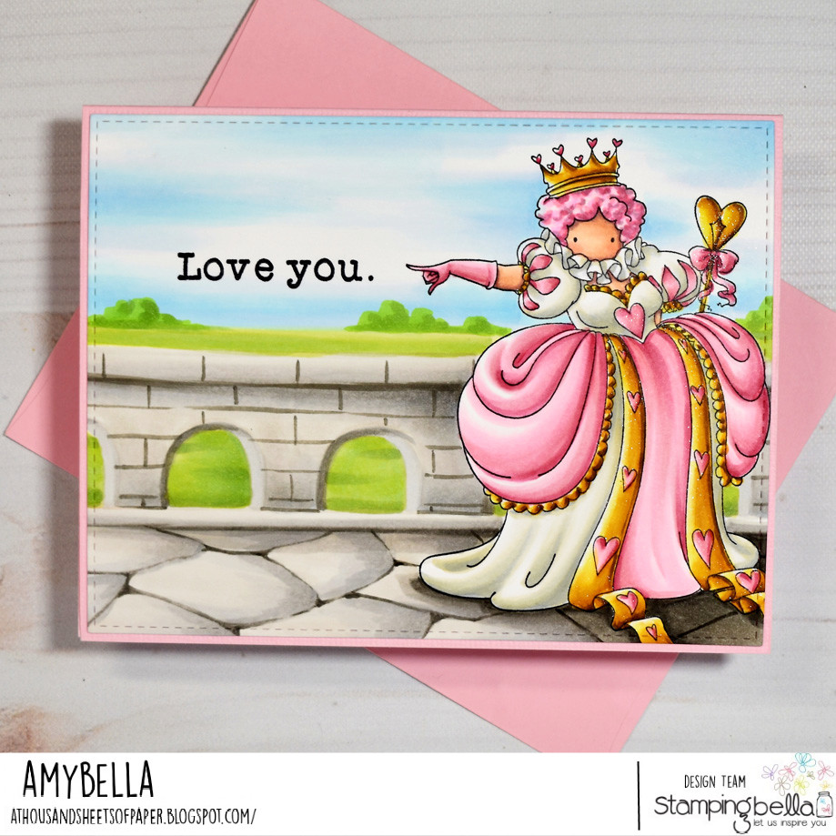
I really wanted to take advantage of her pointing hand and have it directing the viewer’s eye right to the message that I chose from the LOVE SENTIMENT SET. The bold serif font carries the weight of her decree quite nicely, I think. To make room for this effect I flipped the card stock panel to a landscape orientation and stamped the Queen far to the right, even letting some of her gown get cut off at the edges. Not only does this choice allow room for the sentiment but it also creates a more dynamic design than if I had simply stamped her in the center of the card front. With the Queen and sentiment both in place I could start coloring both her and the world she would inhabit. Because I wanted the Queen to have a sweeter look, I opted to deck her out in pretty bubble gum pinks and pale creams… even her wig got the cotton candy treatment. And since she is a royal, the idea of a castle type setting seemed appropriate but I didn’t want the entire background to be stone grey. That’s when the idea to place her on a balcony came to me and from there I started sketching in the floor and railing using a ruler and a very light grey marker. Once the shading and brick/stone detailing were complete it was as simple as adding a wash of blue sky and green fields to fill in the rest of the scene and this card was done. I gotta say… I’m kinda loving this softer side of the Queen of Hearts. 😉
Stay crafty my friends!
Comments are closed.
She’s so pink! I love that color you used. Great job.