Time for another Design Team Thursday! This week we’ve got a fabulous colouring tutorial for you, from our lovely Kerribella, showing you how to colour Stamping Bella images using Derwent Inktense Pencils. There aren’t any obvious skin tone shades in the pencil range, so if you’ve been struggling to choose colours to use and how to blend them to create a natural skin tone this may help!
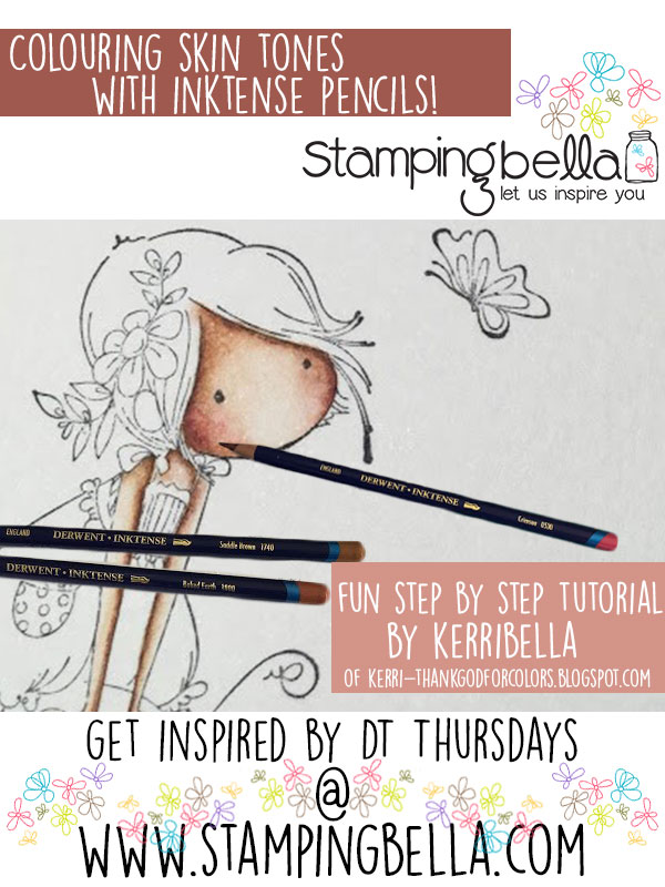
Hi, it’s Kerribella, and for DT Thursday today I am sharing my technique for watercolouring skintones with Derwent Inktense Pencils.
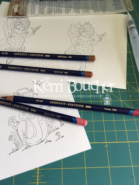
Supply List:
Inktense Colors:
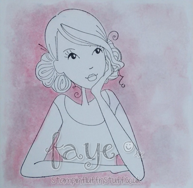
After stamping your image using Staz On ink on watercolour paper, leave it to dry. Ensure that the ink is fully dry before colouring.
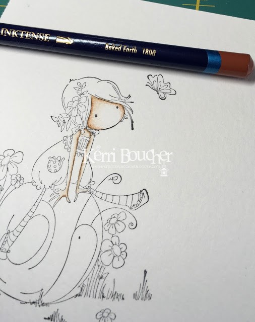
Take your Derwent Inktense pencils and starting with the Saddle Brown pencil draw a thin line of colour where you would find a shadow.
Wet your brush, making sure it is not dripping with water but just slightly wet. Work the line of colour out towards the center of the face. You may have to rinse your brush periodically as the center of the face should remain light. Before moving on let this dry. For this technique it is important to let the colour dry between each layer as you build up the colour.
Repeat this process for the rest of the skin areas.
You may wish to repeat the process twice to achieve the desired level of colour. I did, but try it and see what you prefer.
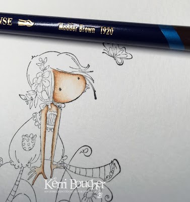
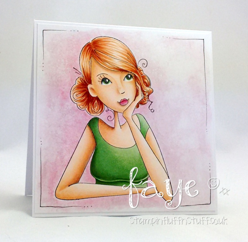
Take your Baked Earth pencil and after making sure your layers are dry apply a thin line and work the colour into the center of the face.
In the same way use a little Madder Brown to deepen your shadows, remembering to first ensure the previous layer is dry.
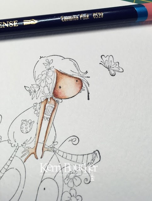
Using either Crimson or Carmine Pink apply a very small amount for the cheeks and blend out.
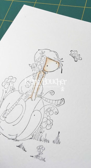
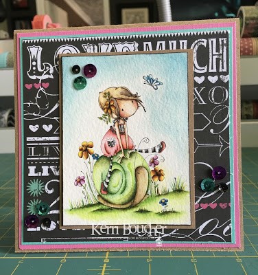
Here’s the completed image on a card!
TOP TIPS:
Always remember to let each layer completely dry before continuing. This will allow you to build up colour without it becoming a mess, as Derwent Inktense Pencils are permanent when dry.
It is easier to add colour than to remove it, so use colour sparingly and build up slowly.
Kerribella
We hope you’ve enjoyed checking out Kerribella’s tutorial and are feeling inspired to try it out yourselves. If you do, make sure you drop by and share with us! You can get in touch in all the following ways:
Happy Stamping!


We hope you’ve enjoyed checking out Sandiebella’s tutorial and are feeling inspired to try it out yourselves. If you do, make sure you drop by and share with us! You can get in touch in all the following ways:
Happy Stamping!
Time for another Design Team Thursday! This week we’ve got a fantastic tutorial for you from our wonderful Micheleabella, sharing how she creates a beautiful brick background for her stamped images.
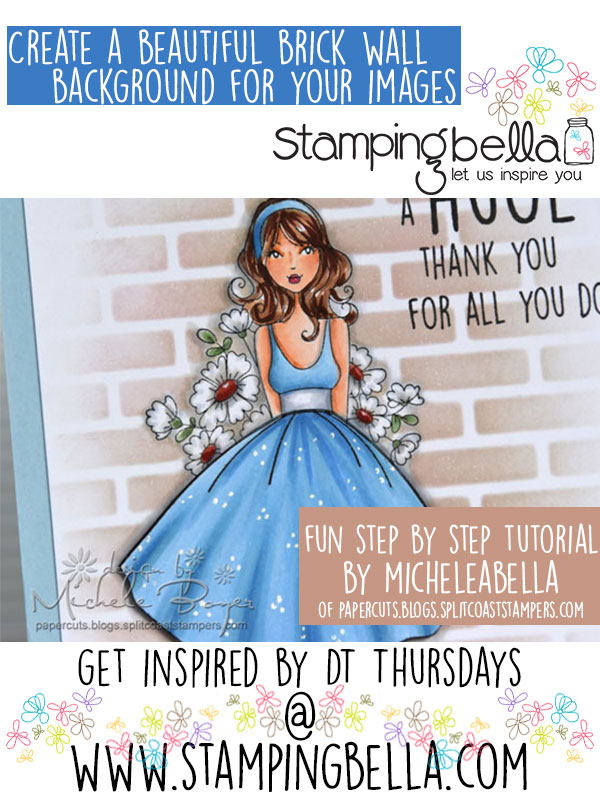
Hi everyone! It’s Michele here today. I had quite a few questions regarding how I created a brick background on a recent Stamping Bella card so I thought I’d share with you how I created that background.
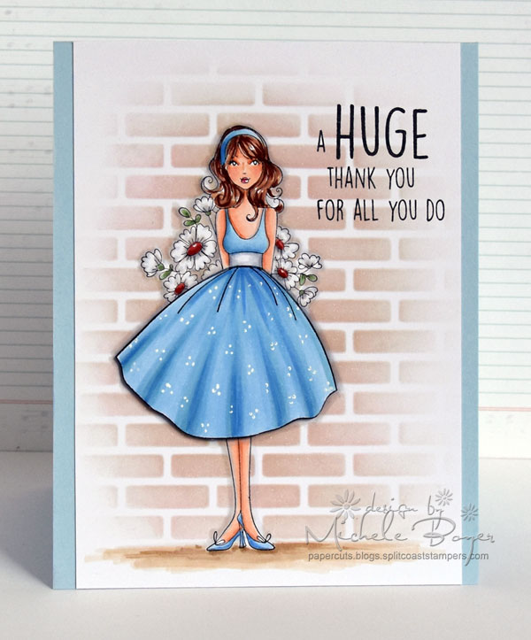
I used new flowersbehindmybackABELLA from the new Bella 2.0 line (LOVE), a couple Post It notes and removable tape, brick stencil, two inks and a blending tool.
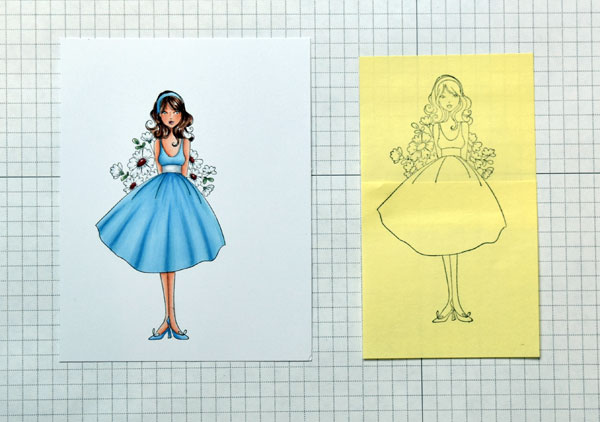
Stamp the image and color with desired medium. (I used Copic markers.) Adhere two Post It Notes together then stamp the image to use as a mask.
Carefully cut out the image, cutting directly on the stamped outline. In the areas such as the flower bouquet, it is not necessary to cut in between each flower. (I’ll address that issue in a bit.)..
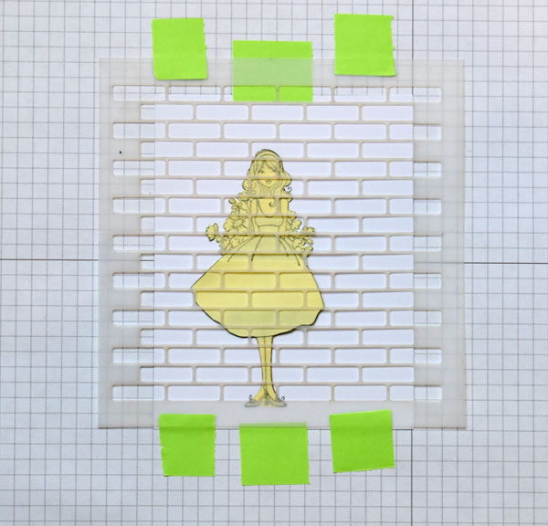
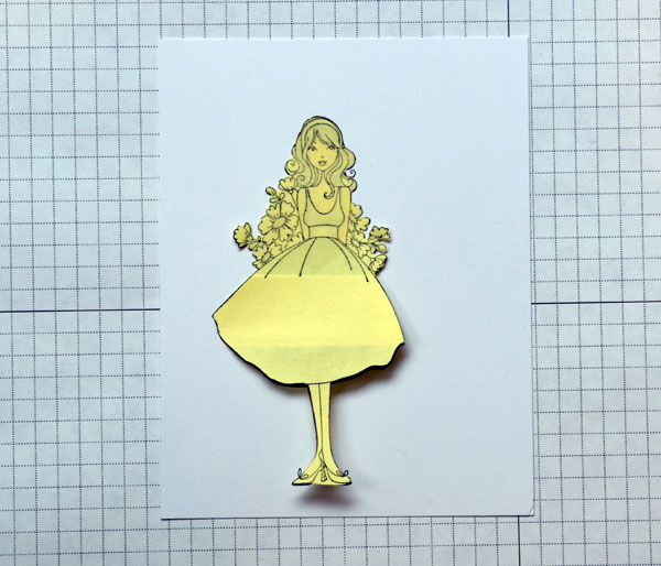
Using removable tape, securely adhere the masked image to scrap paper. Align the stencil over the image and adhere securely with additional removable tape.
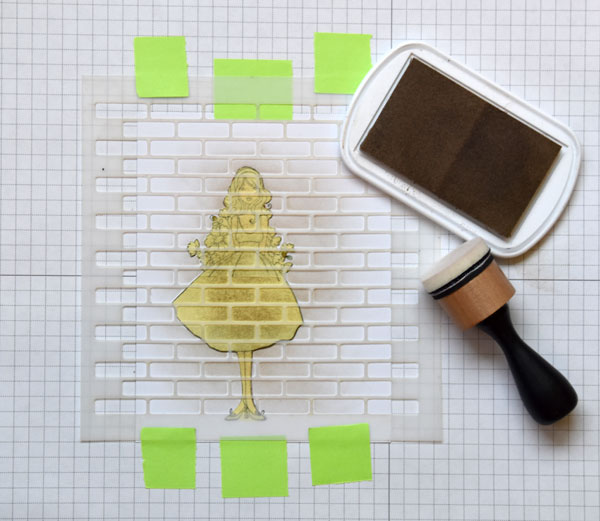
Using the desired base ink color (I used Natural), begin blending ink over the stencil. I achieved the best results by beginning the blending motion over the mask and moving onto the surrounding area using circular motions. As I moved further away from the image, I applied less ink to create the faded edges.
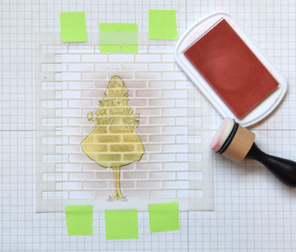
With just a bit of a second color of ink applied to the blending tool (I used a light pink), lightly sweep the blending tool from right to left, applying more ink close to the image. The goal is to apply color to the left side only of each open area to create depth. Additional colors can be applied if desired.
Remove the stencil and mask. There were a few areas where my mask wasn’t exactly aligned but that’s ok. (See the left edge of the dress and left edges of flowers.) I had planned to add shadow around the image anyway to create depth.
In the areas between the flowers where it was too difficult to cut the mask, I used a Copic marker, matched to the brick color, to fill in those white areas. No one will ever know.
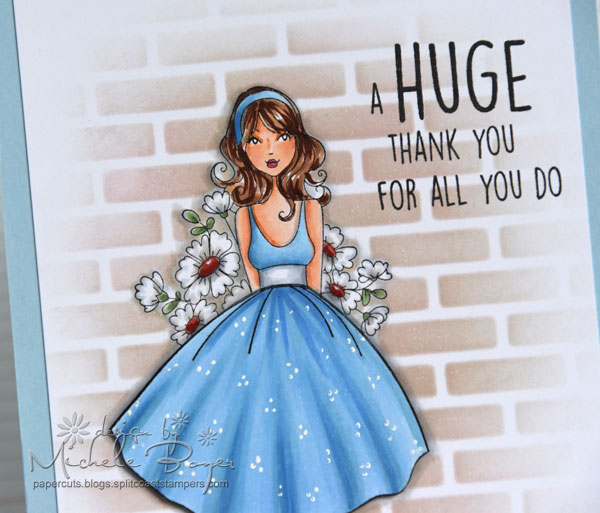
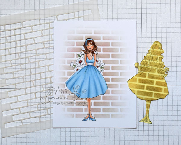
To create additional depth, I decided to stamp the skirt a second time. I colored, added some dots then adhered the top edge directly to the full image and placed thin, clear foam squares beneath the bottom edge.
We hope you’ve enjoyed checking out Shelabella’s tutorial and are feeling inspired to try it out yourselves. If you do, make sure you drop by and share with us! You can get in touch in all the following ways:
Happy Stamping!
Time for another dose of inspiration from one of the Bellarific Babes. It’s Design Team Thursday and this week Faye-WJ-abella has a fun technique to share.
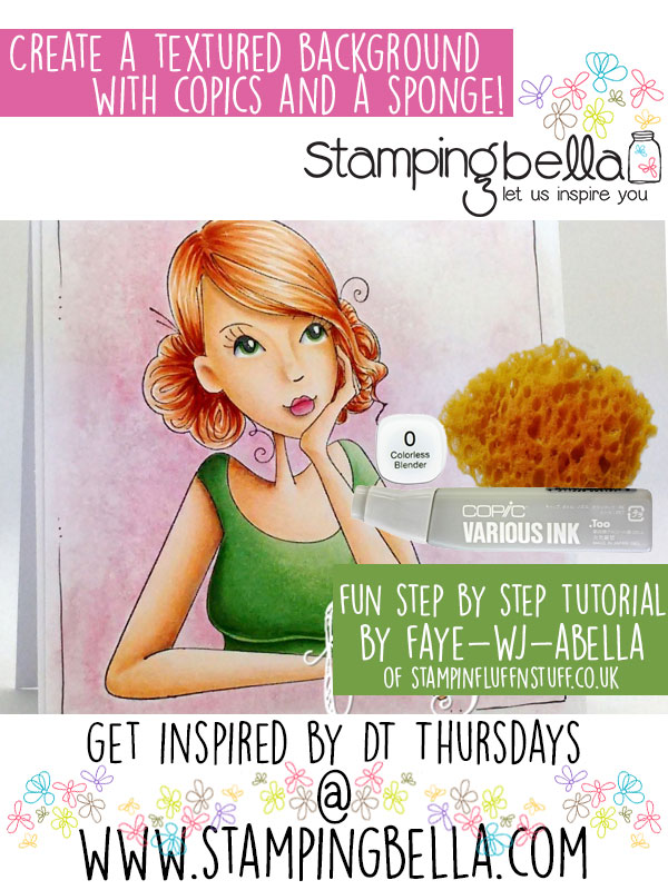
Hey Peeps, it’s Faye here today 🙂
Sponge. Perhaps I’m being a little presumptuous here. But. Sponge. Not just for washing baby arm pits. I know, it’s an overwhelming thought. So, while you let that sink in for a moment, let’s talk about backgrounds.
My style is very clean and simple. But every once in a while, I fancy a little ‘pop’ of colour behind an image. Sometimes, if I feel like getting ink all over my hands, nails and desk, (that’s with scrap paper in place, by the way. If I didn’t have the paper, well. Nuff said.) I’ll get the Air Brush out. And sometimes, I like to get a different fix of Messy. I know, the shocks just keep coming, don’t they?
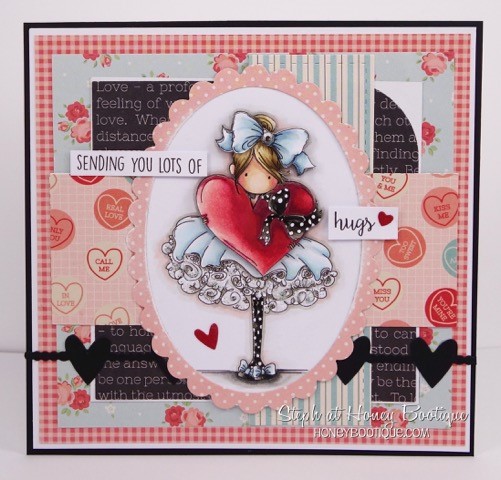
So, let’s take Thinkingofyouabella, who, is perfect for a little Arty Farty Background Moosh. Now, before I tell you that I am going to colour around the edge of the image with RV91 and R81, as rough and messy as I like… You want to do this part first. Trust me, colouring the background first is a must.
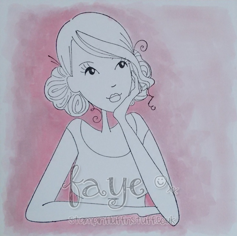
You’ll notice I have already decided my Light Source will be Top Right, which is why I have more of the R81 on the left hand side.
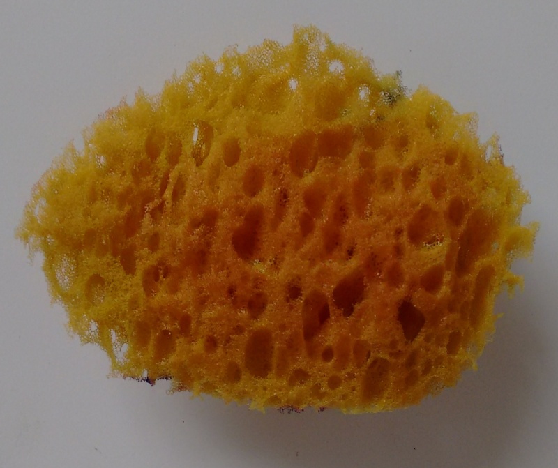
Now, you’ll want a plate, or a Craft Mat, or something you can squirt some Colourless Blender on. Dip your piece of Sponge, (or in fact any fabric with some texture to it, (Put the Bath Towel back please!)) in the Colourless Blender and then apply your Sponge, to the background ink. One pink elephant. Two pink elephants. Three pink elephants. Stop. Move around your image until you have Mooshed the whole lot with the Sponge. You may need to re-dip your sponge as you go.
It’s worth noting that you get different effects by:
I used a lot of wet as that was the effect I wanted, but if you use less, the texture of whatever you are pressing against the paper shows more. So play around.
Now the Mooshing is done, we can colour the image.

Finally, I doodled some and called her done. But that’s only because I chickened out of doing the thing I had planned to do. Maybe I’ll show you that another time 😉
Have a great day.
Faye x
We hope you’ve enjoyed checking out Faye-WJ-abella’s tutorial and are feeling inspired to try it out yourselves. If you do, make sure you drop by and share with us! You can get in touch in all the following ways:
Happy Stamping!


Hey everyone!
Steph here! Today I’m sharing some inspiration on how to give your stamping a fun 3-D decoupage effect!
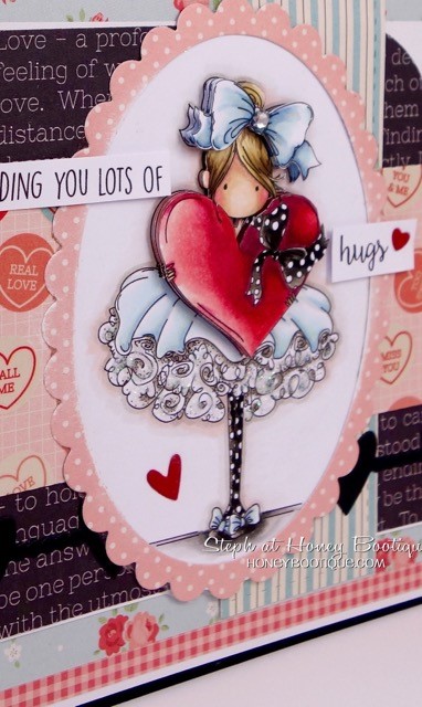
I’ve made a couple of 3-D decoupage effect cards before- see my card below with Tiny Townie Bonnie Loves Bows
This time I’m using Uptownie Winnie Looking Out The Window…
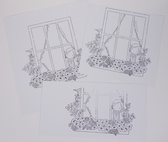
Firstly, you need to look at the image to see what you need to stamp out to create the layers. Here I decided to stamp out:
On the 1st image, I coloured the entire image and paper pieced the curtains. I didn’t worry too much about the quality of colouring on the frame, window box and foliage as these will be covered by other layers.
On the 2nd image (see left here), I coloured the frame and the window box and foliage (not worrying too much about the quality of colouring on the window box and foliage as this will be covered by a final layer). I then cut out the frame and the window box and foliage.
On the 3rd image (see right here), I coloured the window box and foliage and cut out. I then cut out a piece of acetate to fit the window
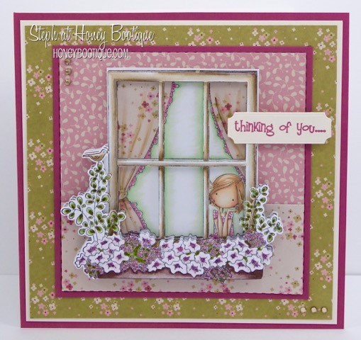
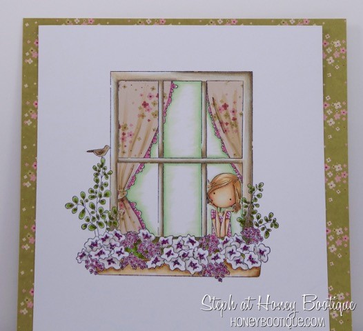
I then made the rest of the card and stamped out the accompanying sentiment. I attached the acetate to the second layer of window frame using very thin (3mm) double-sided tape and assembled all the layers using 3-D foam pads
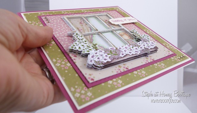
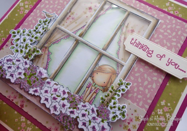
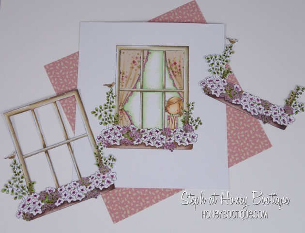
You can see the layers here. I just love the effect it gives. Doesn’t she look so dreamy??!!
Hope you enjoyed this week’s tutorial and have fun creating your own 3-D scenes! x
Alice made a GORGEOUS card for us today with her amazing NO LINE technique! She uses ANTIQUE LINEN Distress Ink and Copic markers.. and she works her magic!
On this card she used our Tiny TOWNIE ANABELLE needs your ADDRESS
Anabelle is such an amazing stamp because as you see, you can put a die cut message in it.. you can use your favorite stamp sentiment in it.. you can even use it in your journal with your thoughts of the day! So versatile, ifidosaysomyself
here’s the closeup just showing you the detail and how beautiful it is.. kind of like watercoloring no?
and here is the final card… I just love it! I hope you do to0!

MWAH
Em
Welcome to Stamping Bella’s Design Team Thursday! Today I’d like to show you a little project that helps us get more use out of our smaller stamped images.
I’m working with two stamp sets. For my main card images I’ve used the Mail Chick set with it’s coordinating dies.
I’ve also cut a piece of red cardstock and a slightly smaller piece of vellum.

The second stamp set I’ll be using is the Mr. Postie’s Mini Envelope Accents and some Versamark ink
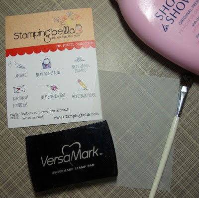
I couldn’t find my regular powder tool so I just grabbed some talcum powder and used a little on the vellum to get rid of any static. I used a paint brush to spread it all over.
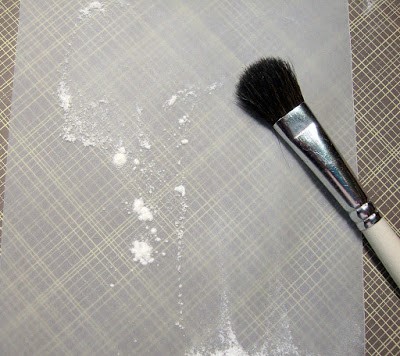
Next I stamped a couple of the images from the Mr. Postie set, the small letter and air mail airplane, randomly on the piece of vellum and then sprinkled on some white embossing powder.
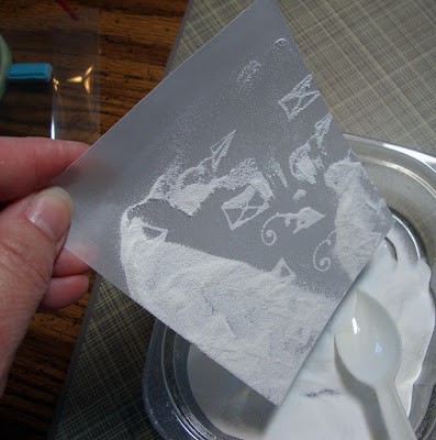
After heating the embossing powder with a heat gun my vellum panel was ready. I then attached it to the red cardstock with a few little dots of glue here and there. I went back later and added a couple more embossed imaged along the top edge to balance out the panel a bit better.

And here you have the finished card with a fun background created from those little accent stamps.
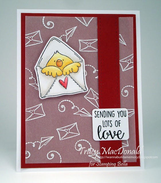
There are other stamps in the Stamping Bella collection that would make awesome backgrounds like the cherries in the Cherry Chick set, the cloud in the Edna Blows a Kiss set, and the Easter Eggs in the Row of Bunny Wobbles set
Don’t let those little treasures gather dust.
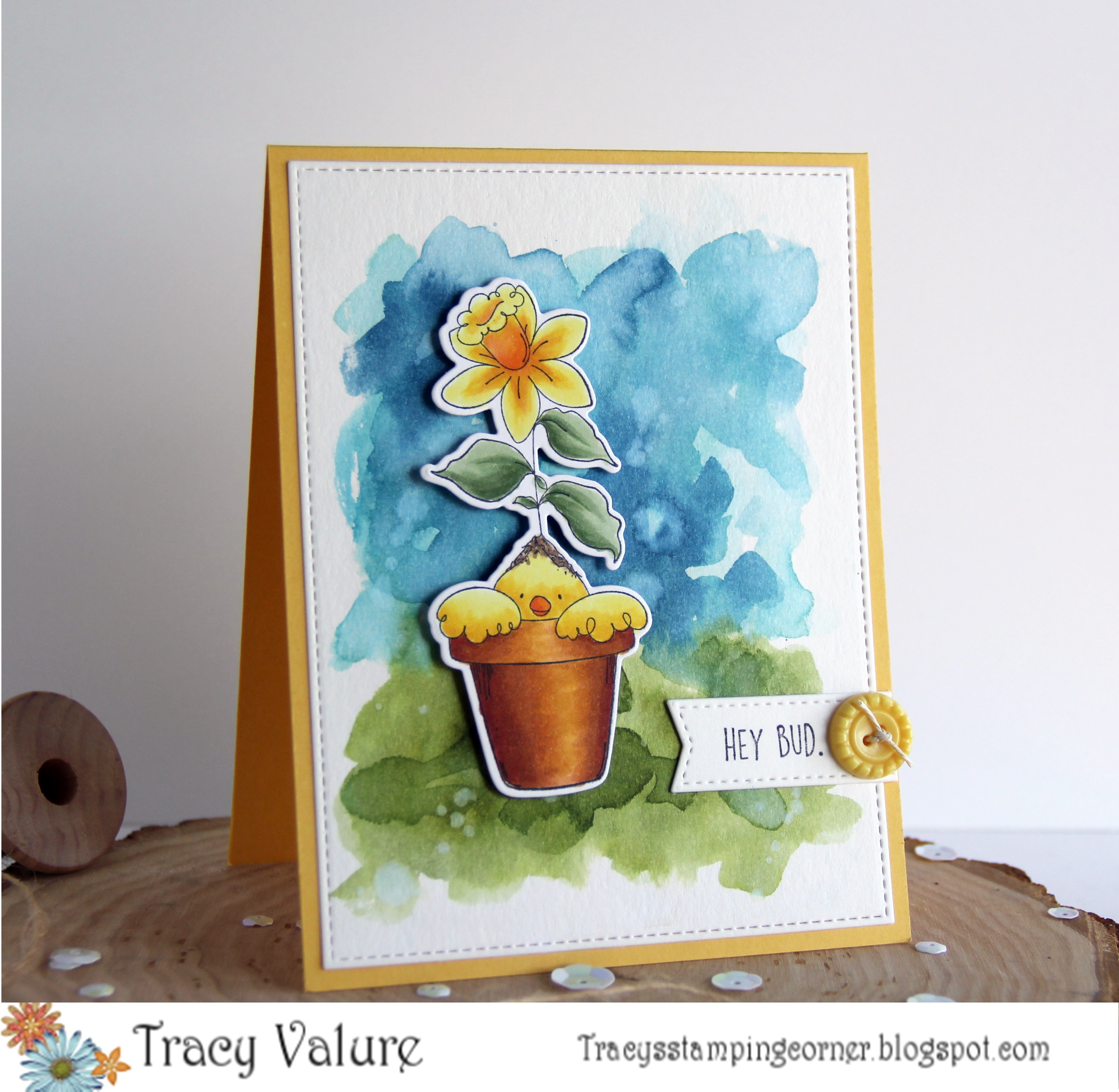
Hi Everyone! Tracy here. Today I am sharing a quick and easy technique to make a watercolor background. You can use whatever watercolor inks/paints you have but today I am using Tim Holtz Distress Inks.

Here is what you need to get started. I’m using Budding Chick Stamp and Budding Chick “Cut it Out” Die. You will need a 4 1/4″ x 5 1/2″ piece of watercolor paper. For backgrounds I use a cheap paper – Artist Loft. For Images I use Canson or Strathmore. The inks that I used are: Tim holtz Distress Inks in Broken China, Faded Jeans, Peeled Paint and Bundled Sage. You can use the pads or reinkers. If using the pads just stamp onto a piece of plastic or something non-porous so that you can lift the ink with your brush.
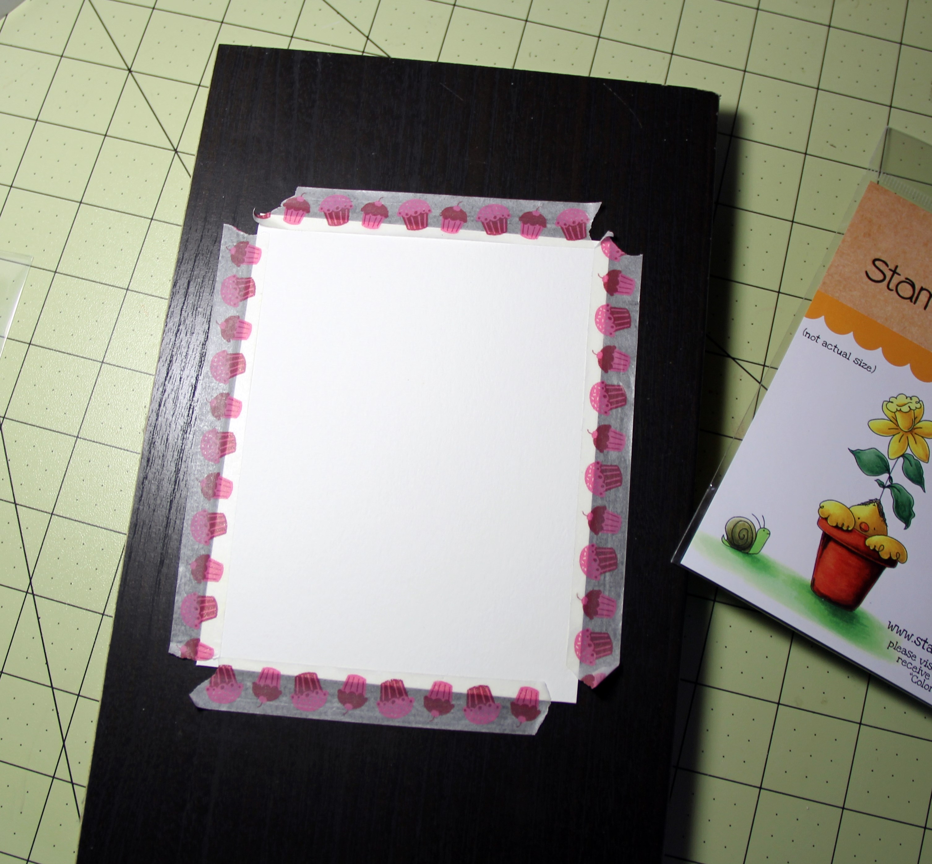
Because I dry my paper between layers – I have this piece of board I use so the heat doesn’t damage my table. You can do whatever you normally would do. I then tape the edges down. This helps in keeping the paper flat and not getting wonky when adding water to it. You can use painters tape, I just use some old washi tape. I like washi because it doesn’t tear the paper.
After you have your paper adhered, wet the paper with plain, clean water. Then lift some of your Peeled Paint ink and start dabbing onto your paper to create the “grass area”. Do the same above with the Broken China.
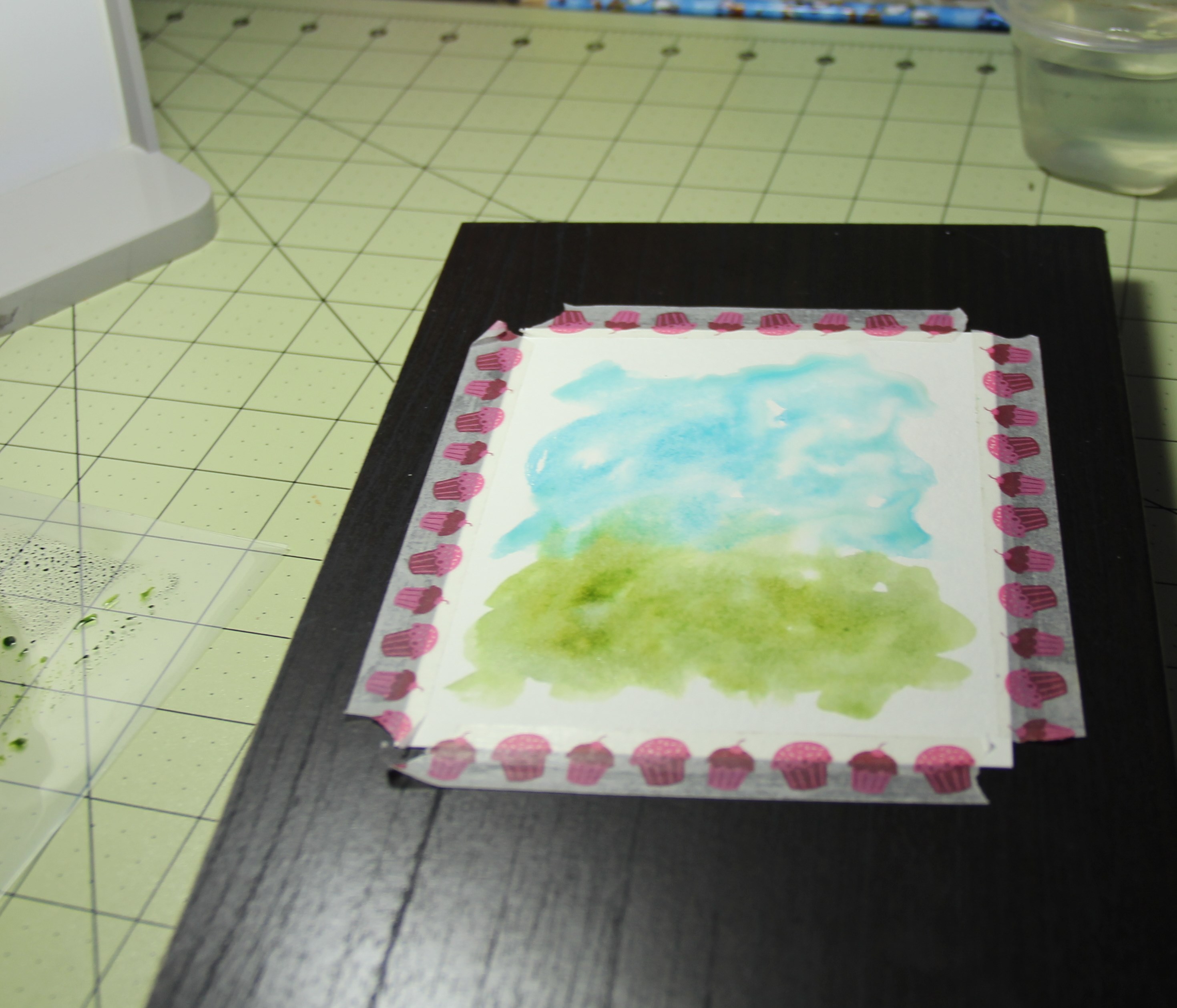
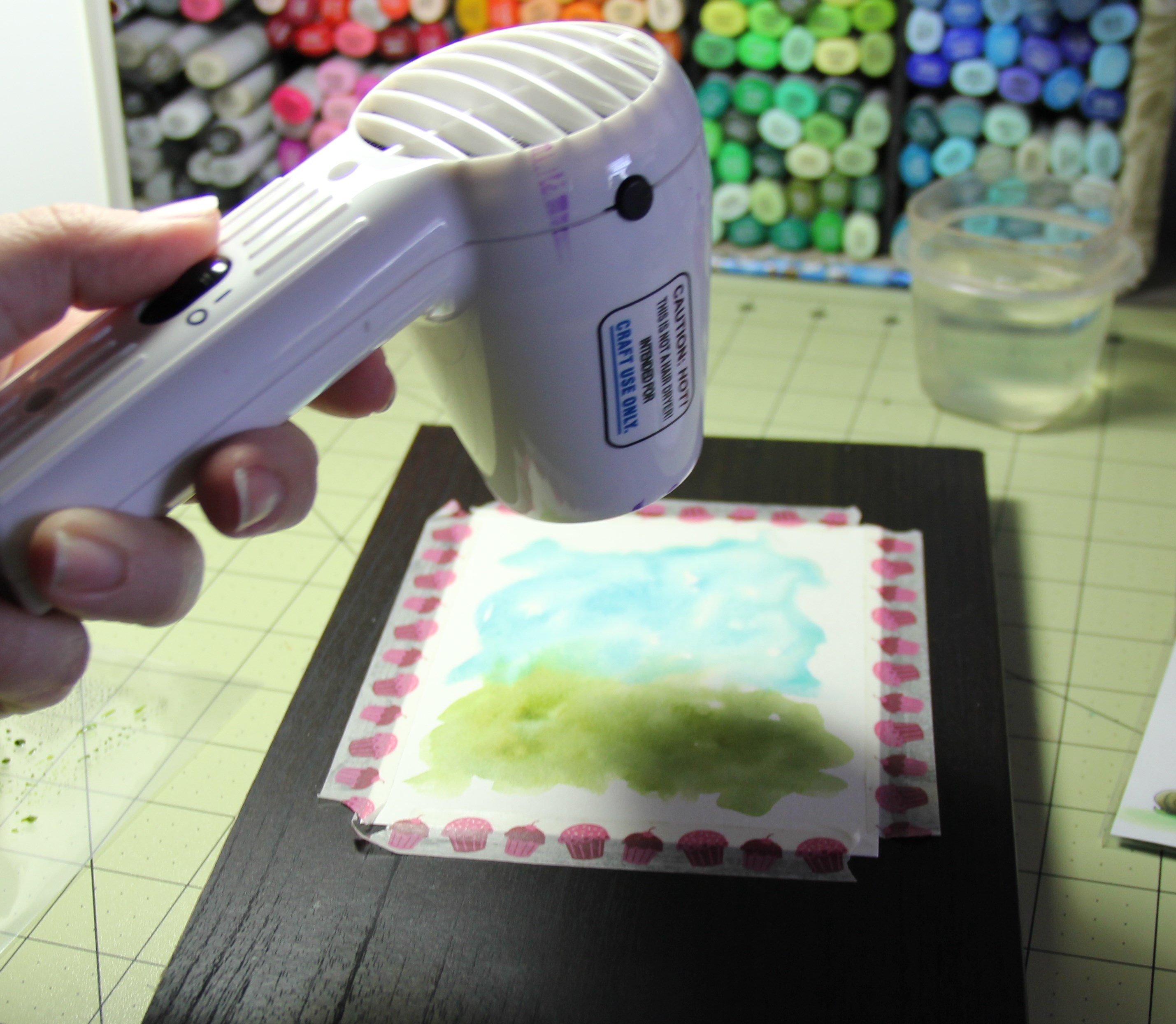
After you add in your inks – heat your paper to dry it. You could just let it dry naturally but I’m antsy and when I work on something, I want to complete it. If you do not let your layers dry in between your inks will get muddy!! You have to dry in between layering.
Now you can go on top and add in a couple of dots of the Faded Jean and Bundled Sage. If it’s too harsh just add some water to the top and let it spread out a bit. You can also take a paper towel and dab it.
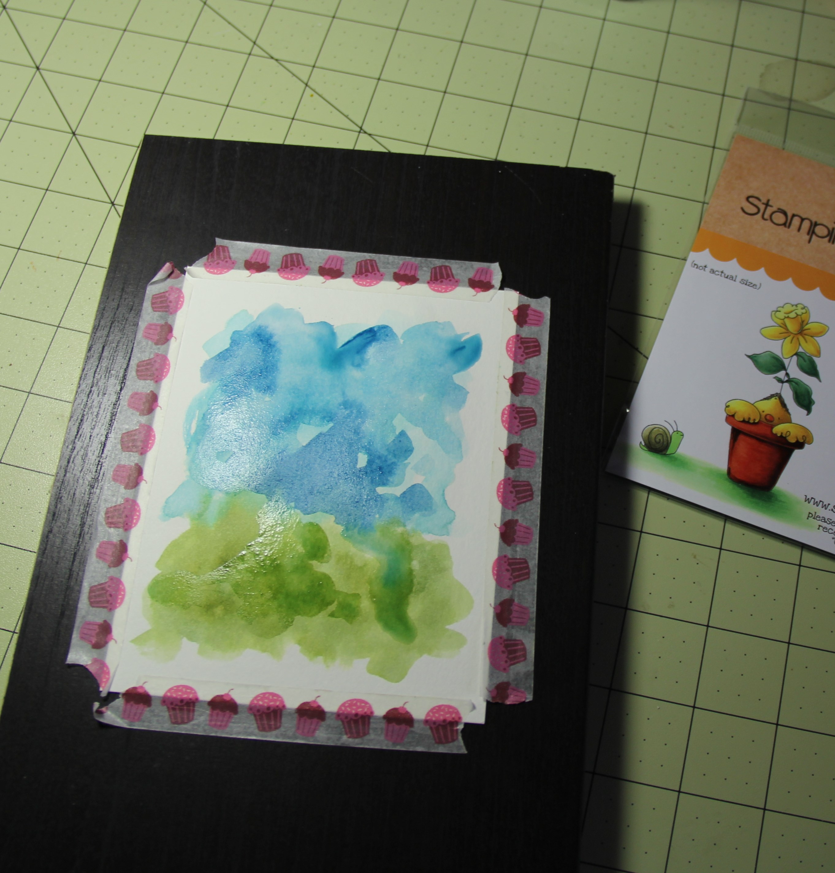
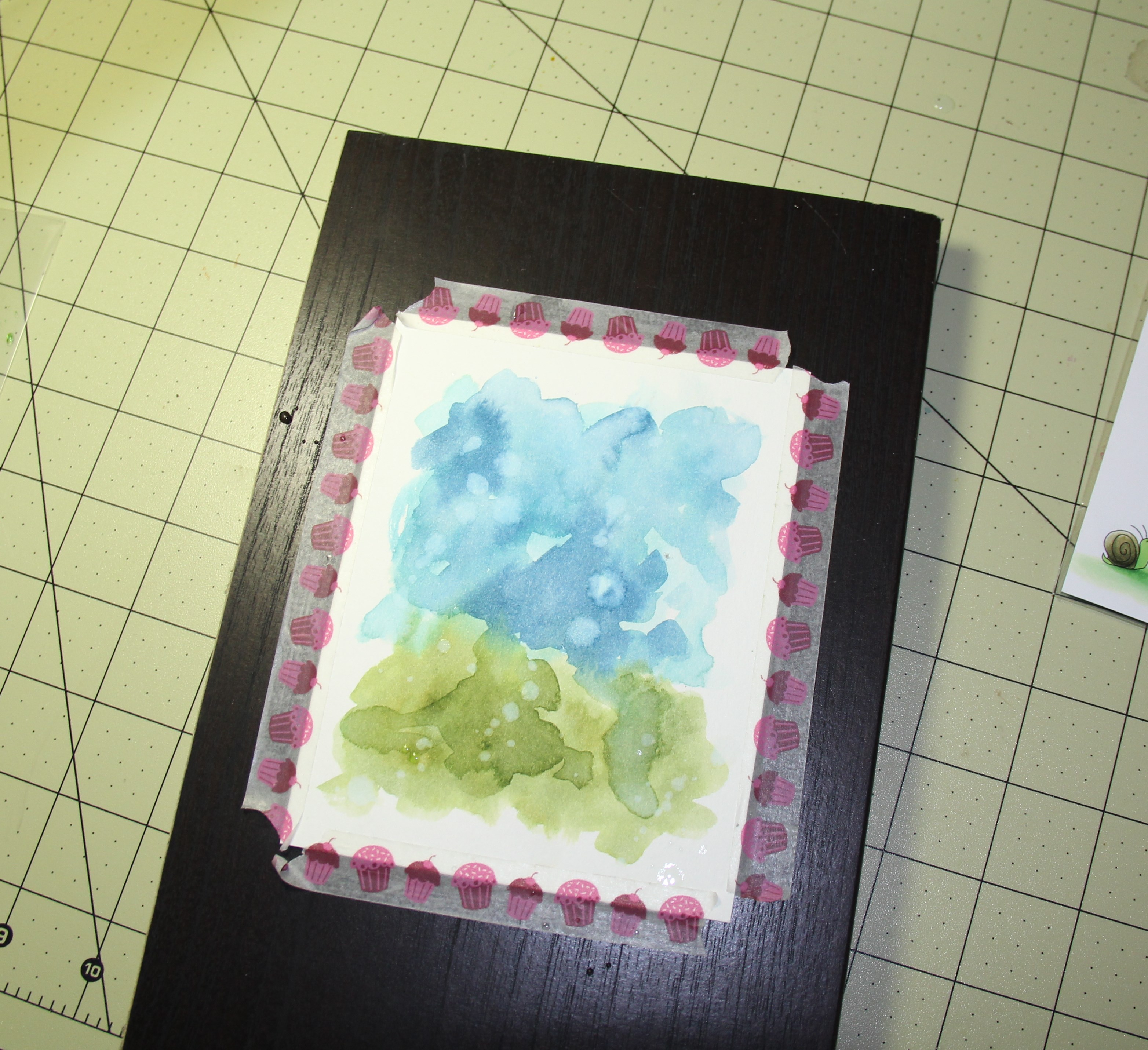
On my final background you can see that there are couple “bleached” out spots. After I added my 2nd layer of colors, I dried it again. Then I took my brush, added some plain water to it and flicked it onto my paper. Let it sit for 10-30 seconds and then took a paper towel and dab the background.
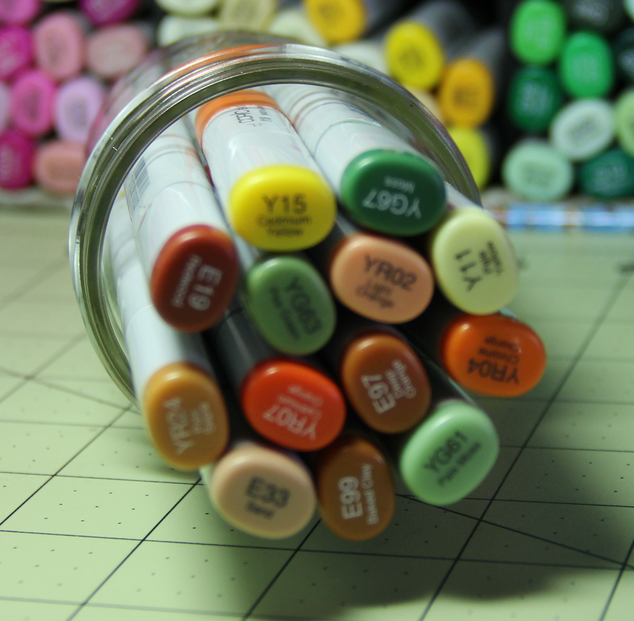
Now onto Coloring the Budding Chick. Below are the colors I used. Sorry for the blurry pic….my camera did not want to cooperate!
After your image is all colored you will then cut it out using the Budding Chicks “Cut it out” Die.
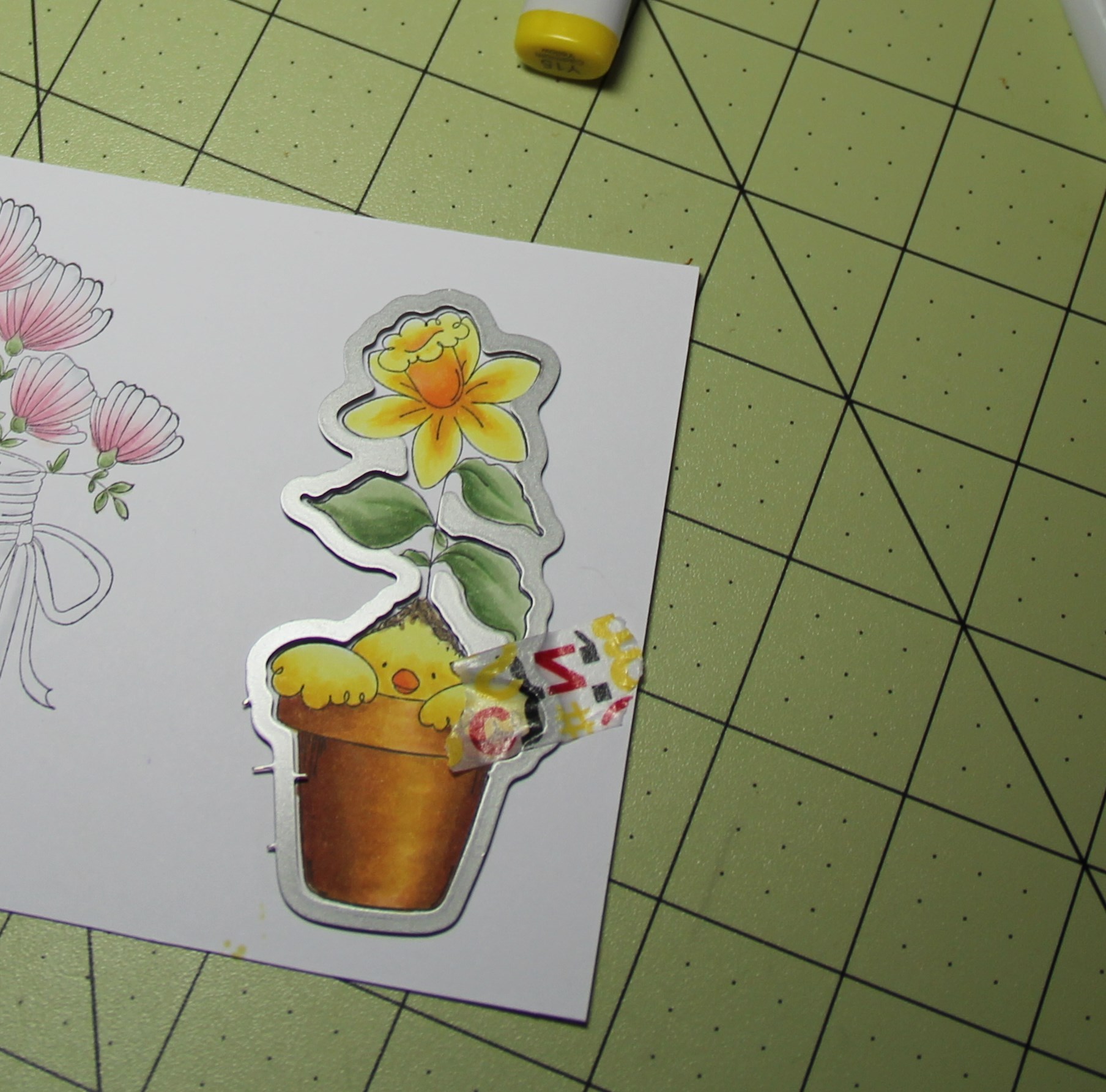
Add some foam squares to the back to “pop” it up.
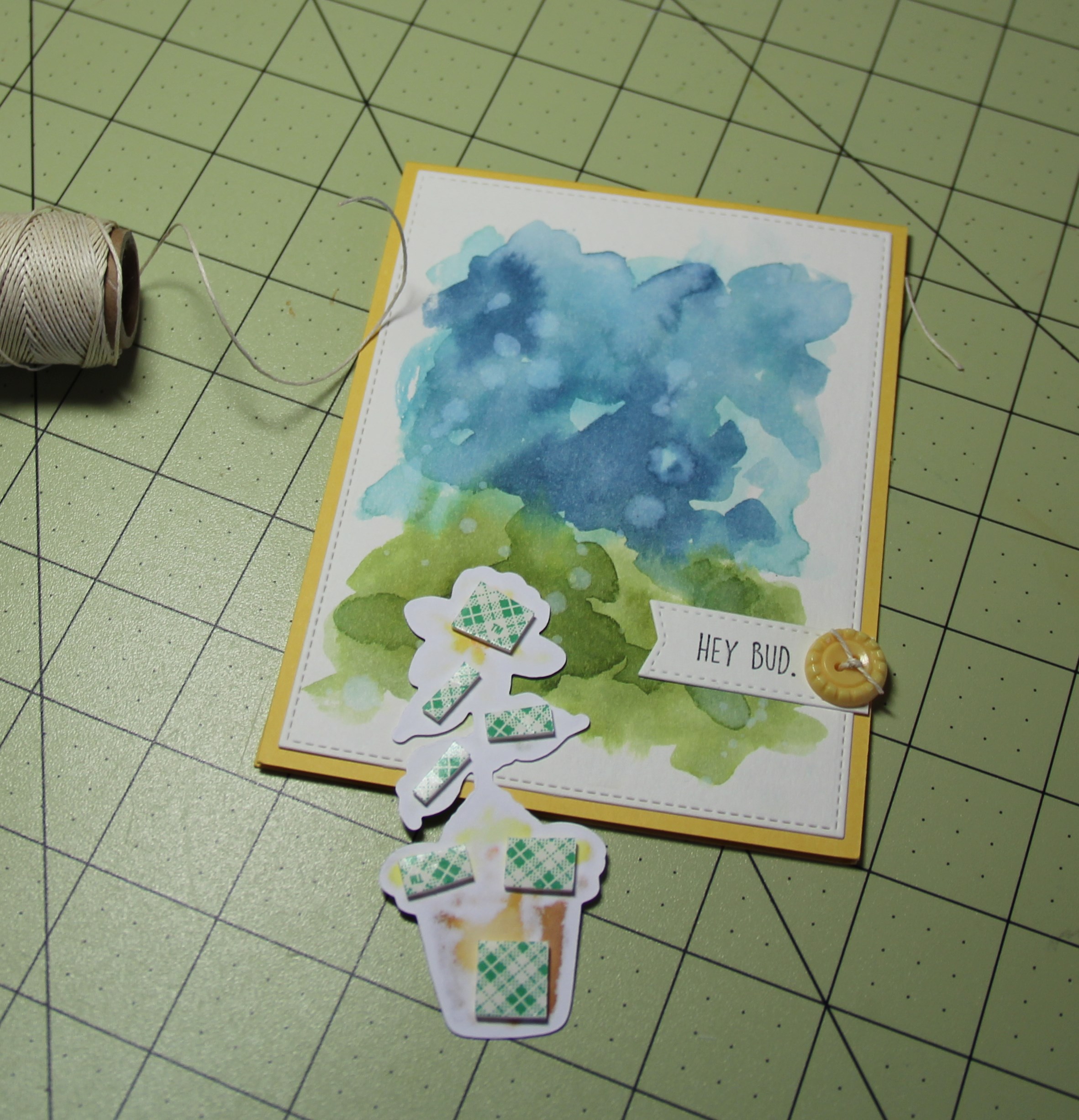
I finished off my card by cutting out the background with a stitched border. Then used a heavy adhesive, like scor-tape, all around the edges to adhere my background. Watercolor paper can get a little wonky, taping it down as we did in the first step will help though! Just use a good strong adhesive.
Next I added a small flagged sentiment and finished it off with a button.
Here is the final card:
Thanks for stopping by!
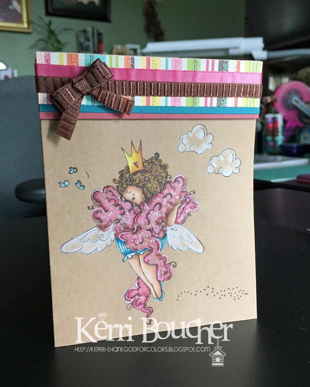
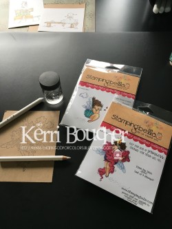
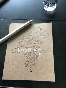
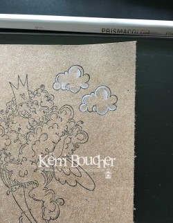
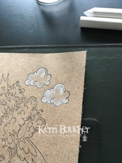
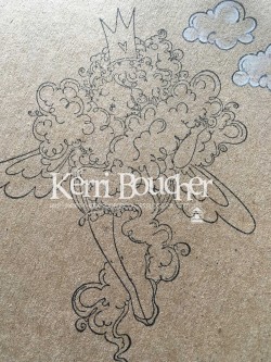
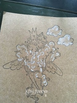
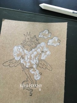
| Good morning and welcome to my first DT Thursday for STAMPINGBELLA.. Now this is my second attempt..First was a video that did not work so I took pics and did it again.. The pics are listed in order.. So for this technique you will nee a few things Gamsol-Odourless Mineral Spirit Prisma Pencil- White Blending Stump Kraft Paper Memento Ink Black STAMPINGBELLA IMAGE Image I used EDNA the DIVA
Ok here you are going to take your White Pencil and outline your cloud..Whee you want it to appear darker..Take your blending stump dip it into the Gamsol and blend the White out towards the centre..
|