Time for another Marker Geek Monday! Hopefully a splash of colour will help banish the Monday blues. 😉
If you’re joining us for the first time you may want to check out the previous Marker Geek Monday posts HERE.
This week I’d like to encourage you to play with your markers (or other colouring mediums) and see how you can achieve variety and interest in your colouring with a limited palette.
As you can see, I’ve been having fun with MONIQUE LOVES MACARONS, one of the fun Stamping Bella Uptown Girl images. This one is perfect for testing out how using markers from one main “combo” in different ways can create different results. On each stamped image I have taken one main Copic combo and used markers from it on each macaron to create an attractive, eye-catching stack.
I’d also like to remind you that your results with the same combos are likely to be different. The look you achieve with your markers will vary depending on how heavily you apply the ink, how much you layer, the order in which you use the markers in a combo, the paper you use etc. This is the beauty of Copic markers – you can build a great deal of depth and variety of colour with quite a limited selection of markers. So, if your collection is still in the early stages, or you are just about to get started, don’t be disheartened! You can have a lot of fun with less markers than you might think. 😉
If you don’t have the colours I’ve used, grab a combo of markers you do have and try something similar with those.
Top Tips:
There’s something quite satisfying about seeing all those colourful macaron stacks! Another great image to play with would be the MACARON BOUQUET stamp.
Have a fantastic, colourful week. Remember to experiment, then pop back and share your results here with us on the blog or over on Instagram using #markergeekmonday ! We love to hear from you, so don’t be shy.
MWAH!
~Elaineabella
Hiya sistahs,
so sorry for the late post… was driving again from Toronto to Montreal to visit my father.. He is recovering but this weekend will be the talk that he should move to Toronto. Wish me luck sistahs!
For this week’s theme we had a MOJOBELLA sketch
let’s see what our baberoonis came up with shall we?
First an announcement. We are saying goodbye to Angelabella as she has a huge job and responsibility at work. I LOVE Angela to pieces and want to thank her for all the hard work, loyalty and love she put into our amazing team. We all wish Angela lots of luck with her new amazing and exciting responsibilities at work!
AliceWERTZabella used MARCHING CHICK
Danabella used MAKE A WISH HOPPY POPPY
FAYE-W-J-abella used Edna blows a kiss Stamp and CUT IT OUT DIE bundle
Kerribella used Edna blows a KISS STAMP and CUT IT OUT BUNDLE AND Edna blows a kiss DAISY BASE STAMP and CUT IT OUT and Edna blows a kiss SIGN BASE stamp and CUT IT OUT bundle
Sandiebella used SLICK CHICK
Shelabella used OWLIVER loves to CELEBRATE
Stephabella used MARCHING CHICK
TracyBELLA used GARDENING CHICKS
TracyMACABELLA used IRON CHEF CHICKS
Are these AMAZING OR WHAT? hmph. if I only had a mm of the talent that our sistahood and our baberoonis have!
Now check out our INLINKZ contributions at the bottom of THIS POST for this week’s contributions
and now for our SISTAHOOD’s email contributions 🙂
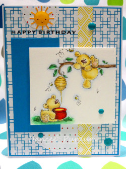
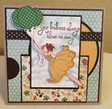
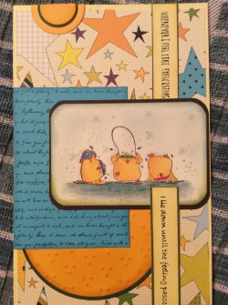
AMAZINGNESS!
Now for next week’s theme?
an inspiration photo! Use the floral theme.. wedding theme.. color scheme.. whatever inspires you sistahs!
Hiya sistahs.. every Thursday, Our DT baberoonis will contribute to my blog by making projects to inspire you! I hope you LOVE DT Thursday as much as I do 🙂
MWAH!
Em
—————————————————————————————————————————————————————————————–
Hi everyone! Michele here. Today I’m sharing tips for adding dimension to our images. It’s easy with two or three extra stamp impressions, a bit of foam tape and a sharp pair of scissors.
In looking at Stamping Bella’s lovely new Uptown Girl, Melanie the Modern Bride. I decided to pop up the bottom portion of her dress as well as her bouquet.
I first stamped a full image onto X-Press It Blending Card. On a second panel, I stamped the bouquet portion and then the skirt portion of the dress.
On the full image, I colored her hair, skin and skirt. When I pop up portions of an image, I always color the bottom layer as sometimes that portion can still be seen along the edges, beneath the raised area. Here, it probably isn’t as important because the area is basically white. I used this opportunity to shade in some pleats and to ensure that’s what I wanted to show on the top layer. (Consider it “practice.”) J
Once I was satisfied with the shading, I colored the separate partial/skirt image the same way.
Next, I did the same thing with the flowers. I colored the flowers on the full image, then the smaller portion to be cut out later. My first intention was to cut out the hanging ribbons as well but then I decided that was insane and only used a portion of that piece (which you will see in a bit).
Once the extra pieces were colored, I carefully cut out each using sharp scissors, cutting right up to the line. Notice that I left a portion of the flowers at the top of the cut out skirt. By including a bit of that area, I avoid cut lines showing once the smaller flower image is adhered over top. I also nipped off the hanging ribbons from the bouquet, leaving the loops to pop up along with the flowers and the ribbons to hang below.
For a realistic look, I wanted the bottom edge of the skirt popped up with the top edge adhered flat. So on the back side of the skirt along the bottom edge, I placed pieces of X-Press It ½” foam tape, and I applied liquid glue at the waistline. A piece of foam tape was adhered to the back of the flowers as well.
Aligning the top and bottom edges, I carefully adhered the skirt, applying pressure to the top portion to secure the liquid glue.
I adhered the flowers, carefully aligning with the flowers below.
I die-cut an oval frame from Blending Card, embossed the dotted lattice design then added foam tape around the back and adhered over the image. (I used Blending Card instead of card stock for the oval panel so that the whites would be a perfect match.)
You can add loads of interest to your work by popping up areas of the design, small or large. I hope you’ll give it a try!
Thanks so much for visiting!
Paulineabella!
Our wednesdays are now used to showcase one of our stamps by an AMAZING appointed featured designah!
I hope you get inspired by Paulineabella’s cards as much as I do.
Here Paulineabella used our UPTOWN GIRL MELANIE the MODERN BRIDE
MWAH!
Em
It’s Monday again, in case you hadn’t noticed! If like me you’re a little stressed by the rapid pace at which the weeks are whizzing by, take a little time to lose yourself in colouring. It won’t slow time down, but it does help reduce stress!
If you’re joining us for the first time you may want to check out the previous Marker Geek Monday posts HERE.
This week we’re back to Copic Markers, and this post is packed with colour combos and tips, so grab a cup of your preferred beverage and settle in! Make sure you read right to the end to grab a bonus colour map for the Stamping Bella Cherry Chick stamp!
Many people complain about colouring with reds, and I’ll admit that they can be tricky. I love colouring reds and maybe that’s because they can be a little challenging. One of the problems you might be experiencing with reds is achieving a nice blend while maintaining depth and contrast. This is where shading with other colours can really help.
In the chart below you will see that I have taken one of my favourite Copic red combos and added shading with markers from other colour families.
The cherry image used in my chart above comes as a separate stamp included with the CHERRY CHICK rubber stamp set.
You can see a similar chart over on my own blog HERE which also has a couple of other base red combos.
For more colour combos for the Cool Chicks check out my previous Marker Geek Monday post HERE.
Copic Reds – General Colouring Tips:
These tips may help if you’re having problems colouring with reds or other rich colours. They aren’t hard and fast rules, but may assist you in “troubleshooting”.
I work by adding a base layer of my lightest red shade, then using my shadow colour to lay down the shading followed by my darkest red shade, then the medium red and back to the lightest red again (I usually repeat the last two steps until I am happy). I use a light hand with each layer, and I try not to go over the darkest areas too much. In very small areas you may wish to start with your darkest shade and work backwards (I talked about this in my hair combos post HERE).
While I was colouring cherries I decided to colour up the entire CHERRY CHICK image again. Love this stamp set, it is perfect for some really fun summer cards and projects, and it presents a great opportunity to play with RED and really get some practice in! Here’s a bonus colour map for you (see HERE for instructions on obtaining the main colour maps for Stamping Bella images).
Have a fantastic, colourful week!
MWAH!
~Elaineabella
Hiya sistahs! Well today is the first Friday of the month.. so we have our baberoonis have come up with inspiration for you using our stamp of the month LULU’S GARDEN OF DAISIES!
Here we go!
Here’s aliceWERTZabella’s card
Danabella’s card
FayeW-Jabella’s card
Kerribella’s card
Lesliebella’s card
Sandiebella’s card
Shelabella’s card
Stephabella’s house
Tracybella’s card
TracyMACAbella’s card
how’s DAT for inspiration? And don’t forget, the image is 20% off all month long!
Now for this week’s sistahood challenge.. RIBBON or WASHI to be used on your card.
Take a look at our INLINKZ contributors at the bottom of THIS POST.. they’re amazing!
and now for our EMAILED contributors!
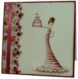
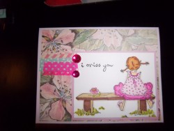
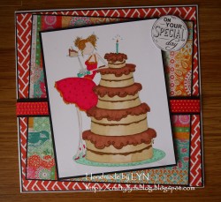
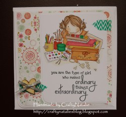
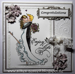
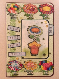
Next week’s theme… a MOJOBELLA SKETCH!
mwah to da sistahs who are gonna get CRAFTY!