WELCOME TO BLOGABELLA

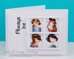
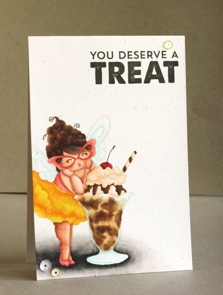
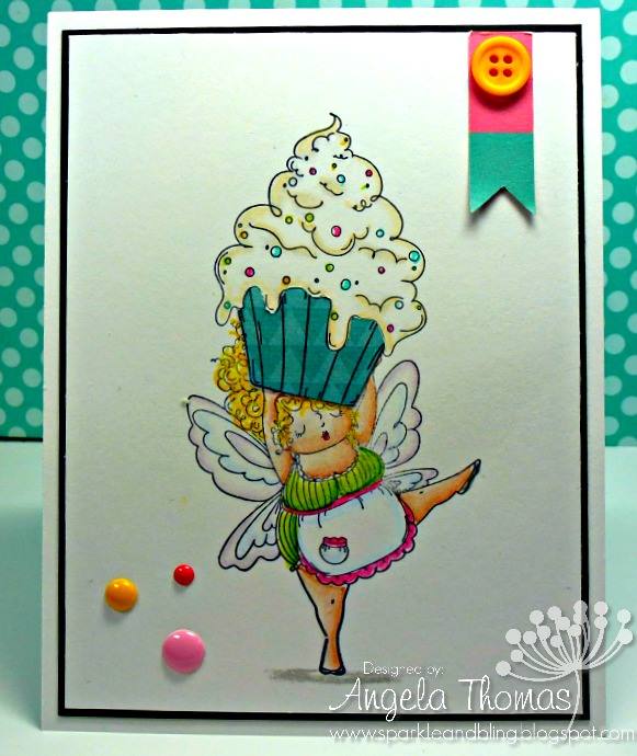
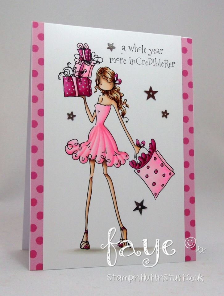
It’s DT (design team) Thursday!

Hiya sistahs.. every Thursday, Our DT baberoonis will contribute to my blog by making projects to inspire you!  I hope you LOVE DT Thursday as much as I do 🙂

MWAH!

Em

—————————————————————————————————————————————————————————————–

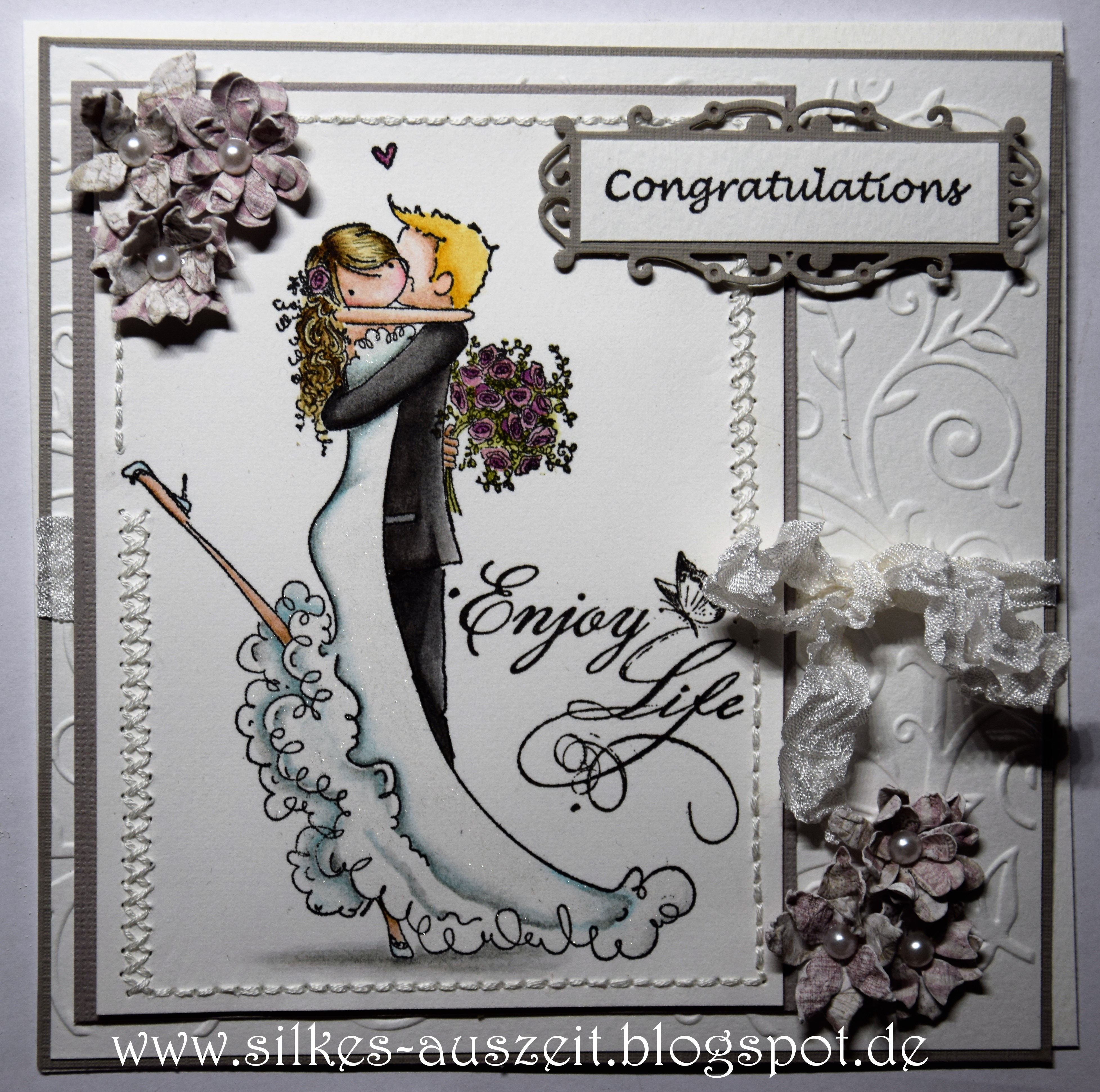
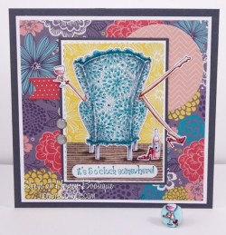
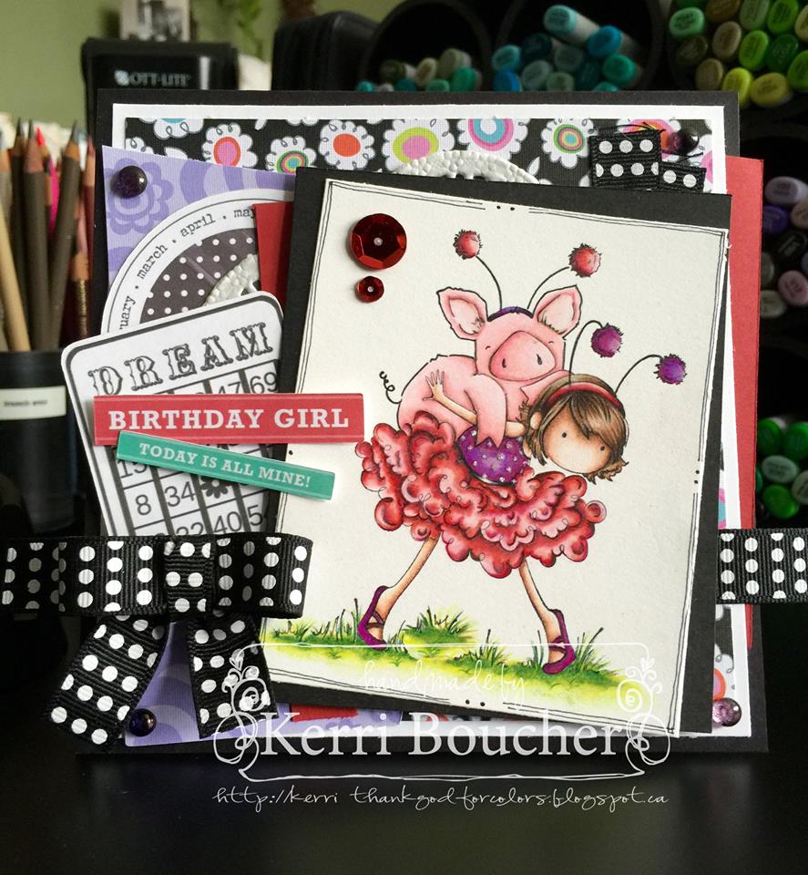
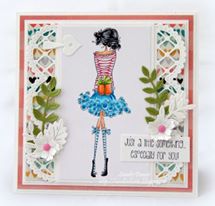
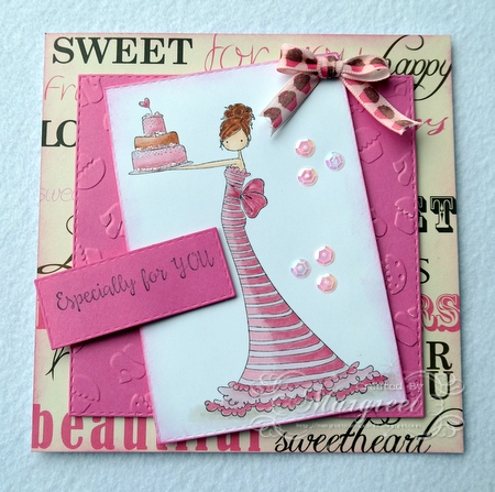
Hi everyone!  Michele here. Today I’m sharing tips for adding dimension to our images.  It’s easy with two or three extra stamp impressions, a bit of foam tape and a sharp pair of scissors.

Photo 1

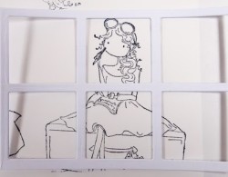
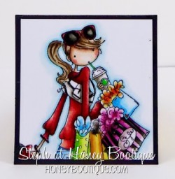
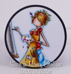
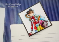
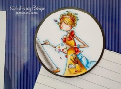
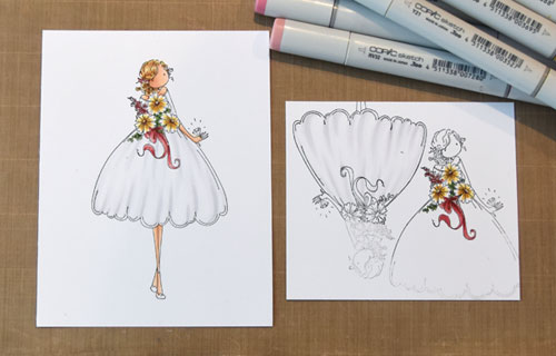
In looking at Stamping Bella’s lovely new Uptown Girl, Melanie the Modern Bride. I decided to pop up the bottom portion of her dress as well as her bouquet.

Photo 2

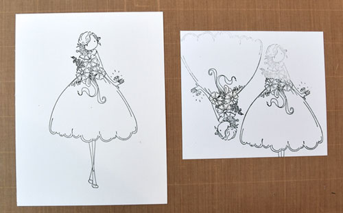
I first stamped a full image onto X-Press It Blending Card. On a second panel, I stamped the bouquet portion and then the skirt portion of the dress.

Photo 3

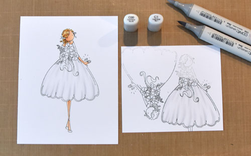
On the full image, I colored her hair, skin and skirt. When I pop up portions of an image, I always color the bottom layer as sometimes that portion can still be seen along the edges, beneath the raised area. Here, it probably isn’t as important because the area is basically white. I used this opportunity to shade in some pleats and to ensure that’s what I wanted to show on the top layer. (Consider it “practice.”)  J

Once I was satisfied with the shading, I colored the separate partial/skirt image the same way.

Photo 4

Next, I did the same thing with the flowers. I colored the flowers on the full image, then the smaller portion to be cut out later. My first intention was to cut out the hanging ribbons as well but then I decided that was insane and only used a portion of that piece (which you will see in a bit).

Photo 5

Once the extra pieces were colored, I carefully cut out each using sharp scissors, cutting right up to the line. Notice that I left a portion of the flowers at the top of the cut out skirt. By including a bit of that area, I avoid cut lines showing once the smaller flower image is adhered over top. I also nipped off the hanging ribbons from the bouquet, leaving the loops to pop up along with the flowers and the ribbons to hang below.

Photo 6

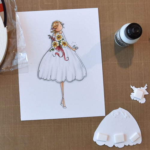
For a realistic look, I wanted the bottom edge of the skirt popped up with the top edge adhered flat.  So on the back side of the skirt along the bottom edge, I placed pieces of X-Press It ½” foam tape, and I applied liquid glue at the waistline. A piece of foam tape was adhered to the back of the flowers as well.

Photo 7

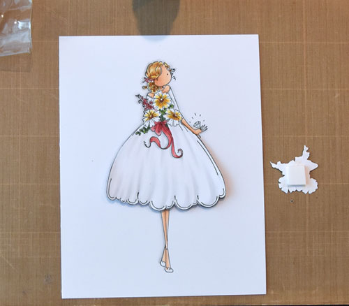
Aligning the top and bottom edges, I carefully adhered the skirt, applying pressure to the top portion to secure the liquid glue.

Photo 8

I adhered the flowers, carefully aligning with the flowers below.

Photo 9

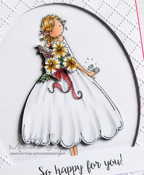
I die-cut an oval frame from Blending Card, embossed the dotted lattice design then added foam tape around the back and adhered over the image.  (I used Blending Card instead of card stock for the oval panel so that the whites would be a perfect match.)

You can add loads of interest to your work by popping up areas of the design, small or large. I hope you’ll give it a try!

Thanks so much for visiting!

it’s MARKER GEEK MONDAY!

It’s Monday again, in case you hadn’t noticed! If like me you’re a little stressed by the rapid pace at which the weeks are whizzing by, take a little time to lose yourself in colouring. It won’t slow time down, but it does help reduce stress!


If you’re joining us for the first time you may want to check out the previous Marker Geek Monday posts HERE.


This week we’re back to Copic Markers, and this post is packed with colour combos and tips, so grab a cup of your preferred beverage and settle in! Make sure you read right to the end to grab a bonus colour map for the Stamping Bella Cherry Chick stamp!


Many people complain about colouring with reds, and I’ll admit that they can be tricky. I love colouring reds and maybe that’s because they can be a little challenging. One of the problems you might be experiencing with reds is achieving a nice blend while maintaining depth and contrast. This is where shading with other colours can really help.


In the chart below you will see that I have taken one of my favourite Copic red combos and added shading with markers from other colour families.


copicredshadingMAY9


The cherry image used in my chart above comes as a separate stamp included with the CHERRY CHICK rubber stamp set.

You can see a similar chart over on my own blog HERE which also has a couple of other base red combos.

For more colour combos for the Cool Chicks check out my previous Marker Geek Monday post HERE.


Copic Reds – General Colouring Tips:

These tips may help if you’re having problems colouring with reds or other rich colours. They aren’t hard and fast rules, but may assist you in “troubleshooting”.

  • Use a light touch: when colouring with markers in general (and most media) I find it best to use a light hand, and this is definitely the case when colouring with reds and other richly pigmented colours. If you are heavy handed and lay down too much colour at once blending becomes more difficult, and in laying down even more ink to blend you will run in to problems with the ink bleeding over the lines. Use a light touch and lots of layering.
  • Feather/flick: rather than colouring in circles, lay colour down with a flicking/feathering motion. Don’t try to soak the paper evenly.
  • Save reds till the end: if you plan on colouring other surrounding parts of your image in lighter colours, colour those areas first so that you can avoid accidentally pulling reds in to areas you don’t want them. At the same time, you may want to allow the lighter areas to dry completely before starting to colour the reds to avoid the red ink travelling into those areas.
  • Avoid the lines: if you experience issues with reds bleeding over the lines even when using a lighter touch, try not colouring right up to the lines of your image. This will give the ink a “buffer zone” to move in.
  • Don’t fuss with small areas: avoid trying to blend too much in small detail areas, it is almost guaranteed to end in a mess. You can get away without achieving a smooth blend in many small detail areas and avoid a headache in the process.
  • Try a different paper: if you are having real difficulties working with reds, you may want to try out some different papers. Softer more absorbent papers will tend to bleed more.
  • Adjust your colours: if you are having to lay down a lot of ink to blend your chosen colours, you might find tweaking the colour combo helps. Test out some alternatives and see if they play together better. The more ink you are having to lay down to achieve a reasonable blend, the more likely you are to experience issues with bleeding.

I work by adding a base layer of my lightest red shade, then using my shadow colour to lay down the shading followed by my darkest red shade, then the medium red and back to the lightest red again (I usually repeat the last two steps until I am happy). I use a light hand with each layer, and I try not to go over the darkest areas too much. In very small areas you may wish to start with your darkest shade and work backwards (I talked about this in my hair combos post HERE).

While I was colouring cherries I decided to colour up the entire CHERRY CHICK image again. Love this stamp set, it is perfect for some really fun summer cards and projects, and it presents a great opportunity to play with RED and really get some practice in! Here’s a bonus colour map for you (see HERE for instructions on obtaining the main colour maps for Stamping Bella images).


cherrychickCOLORMAP


Have a fantastic, colourful week!


MWAH!


~Elaineabella

it’s BELLARIFIC FRIDAY!

Hiya sistahs!  Well today is the first Friday of the month.. so we have our baberoonis have come up with inspiration for you using our stamp of the month LULU’S GARDEN OF DAISIES!

Here we go!

Here’s aliceWERTZabella’s card

alicewertzabella

Danabella’s card

danabella

FayeW-Jabella’s card

fayeWJabella

Kerribella’s card

kerribella

Lesliebella’s card

lesliebella

Sandiebella’s card

sandiebella

Shelabella’s card

shelabella

Stephabella’s house

stephabella

Tracybella’s card

tracybella

TracyMACAbella’s card

tracyMACAbella

how’s DAT for inspiration?  And don’t forget, the image is 20% off all month long!

Now for this week’s sistahood challenge.. RIBBON or WASHI to be used on your card.

Take a look at our INLINKZ contributors at the bottom of THIS POST.. they’re amazing!

and now for our EMAILED contributors!


susan

Susan used our BUDDING CHICK stamp and die bundle and Edna Blows a kiss DAISY BASE stamp and CUT IT OUT DIE bundle

How amazing are all of these cards??? Run.. I say RUN to your crafting space and have some fun sistahs!

Next week’s theme… a MOJOBELLA SKETCH!

sketch


mwah to da sistahs who are gonna get CRAFTY!


IT’S DESIGN TEAM THURSDAY!

Hi Sistahs,

Welcome to a new segment of our blog.. where each of our baberoonis will take turns trying to inspire you 🙂

Stephabella starts us off today.  This is SO exciting 🙂


Hi everyone!

Stephabella here and I’m so excited to be kicking off  DT Thursdays.

I’m always looking at my stamps to see how I can get more use out of them and how I can create different looks. One of the ways I love to do this is by stamping a portion of an image rather than the entire stamp.The projects I’m going to show you today will hopefully give you some ideas on how to do this as well as using stamps with some different mediums you might not have thought about- so let’s get started!


A while ago I made this card by using only a portion of some of my fav Uptownie stamps. I really had fun doing it so I thought I’d make another one for this tutorial.

stephabella1

It’s a nice and simple card to do but made using only a small proportion of each of the stamps to give a completely different look.

I used Madison Has A MargeritaVienna On Her VespaMaybelline Loves Mail and Ava Loves To Celebrate. The sentiment is from Samantha And Sierra Take A Selfie.

stephabella2

A tip for a project like this is to stamp out on scrap paper all the images you think might work for the project

stephabella3 stephabella4

Then use the frame you’re using for the project to help you select what images might work best and to plan out what part of the image you’re going to use- bearing in mind, you might want to do some masking like I did with Perry’s pear. It also helps with placement of the frame as it’s sometimes interesting not to centre the image – like with Molly, I didn’t want any white space above her head as I wanted to show off as much of her dress as possible.

stephabella5

Here are the Uptownies I picked for this project all coloured up.

I used Molly Makes A DetourPerry On Her LaptopBrynn Has A Baby Shower and Isabelle Loves Ice Cream.

As you can see for the final image, I masked off Perry’s pear and Brynn’s other arm.

And here is the finished project…

stephabella6

It’s a lot of fun to use more than one gorgeous Uptownie on a card, no?

I thought I’d show you a couple of other fun projects you can make using only a portion of a stamp.

stephabella7

How about a tag using a part of Downtown Guy Calvin Loves His Computer?

stephabella8

Or what about a cute teeny tiny matching brad using the wine glass from Reilly Loves To Relax?

stephabella9 stephabella10

Or my personal favs- some cute magnets using part of Charlotte Loves To Shop and Abigail The Artist. Here they are in action on my memo board…

stephabella11 stephabella12

I hope you’ve enjoyed the first Stamping Bella DT Thursday and have maybe been inspired to look at your stamps in a fresh way!

it’s WONDERFUL WEDNESDAYS WITH….

Paulineabella! Do you sistahs remember our amazingly talented Paulineabella?  She will always have that name as she was on our Baberooni team a few years ago and I know her personally and adore her!  Pauline has agreed to inspire us with some cards on Wednesdays for May and June.  How lucky are we?

You can find Pauline’s blog here.. go and get inspired!

For today’s post, Pauline used UPTOWN GIRL TIFFANY LOVES TO TEXT

tiffanyPAULINE

I just love this card so much.. I hope you do too!

MWAH!

Em

it’s CRAZY TUESDAY sistahs!

every FIRST TUESDAY of EVERY MONTH we offer 3 images at CUHRAZY prices!  This lasts 24 hours only and then it goes back to regular price.

Crazy Tuesdays are our way of thanking you for being such loyal and amazing sistahs/customers.   It’s a great way to have some retail therapy without breaking the bank!  Its’s a great way to collect our images and to share with friends!  It’s just an all around good thing 🙂

here’s our feature today!.. it will be gone by midnight

crazytuesdaymay2016

click HERE to SHOP

oh and our stamp of the month is LULU”S GARDEN OF DAISIES!  20% off all month long 🙂

banner1may2016

Mwah to da sistahs who Love Crazy TuesdayS!

Em

It’s MARKER GEEK MONDAY!

Thank you for joining me again for another colourful start to the week! If you’re just joining us you may want to check out the previous Marker Geek Monday posts HERE.


Today’s post will be the last pencil related one for a little while. My markers are starting to sulk! If pencils are your thing though, don’t worry, I will be mixing things up again soon. 😉


As promised last week, today I am exploring a more budget-friendly option for colouring with pencils. Perhaps you’re just starting out (or know someone who is) and want to try out the medium before making a larger investment, or perhaps you want a cheaper option for colouring on the go when travelling etc, or like me you have a problem with collecting colouring mediums. This post is for you!


Like me, many of you probably grew up with the Crayola brand. Coloured pencils, crayons, markers, novelty stamping markers etc. If you have children, they probably have a pack or two in their art supplies. It is easy to dismiss them as “for kids” and as such “limited”. Fact is, you can achieve some great results with cheap art supplies. It is definitely nice to have the expensive professional quality stuff, and there are definite advantages, but for colouring stamped images you can get a lot of mileage out of cheaper brands. Don’t feel that because you can’t or don’t want to afford the high end supplies that you can’t have fun or create beautiful coloured images. You can.

2016_stampingbella_marker_colouring_budget_crayola_pencils_petunia_pig_chicks_001


In the first example I limited myself to using colours from the 24 pack of Crayola coloured pencils. You can pick these up for around £3 to £5 here in the UK, and from a quick look on Amazon around $5 in the US. In the second and third examples I used pencils from the 50 pack.


I used Zest-It Pencil Blend as a solvent to blend together with blending stumps. Zest-It is an alternative to odourless mineral spirits like Gamsol.


Petunia and the Cool Chicks look pretty good, right? You can see how they look in Prismacolor and Polychromos pencils in last week’s post. The stamp is called “Nice to See You Petunia” and is available along with more Petunia Pig stamps and other adorable creatures in the Woodsies range at Stamping Bella. The “Cool Chicks” have their own section in the store, although they are becoming known for popping up all over the place to make us laugh.


As much as I love my more expensive art supplies, I think it’s also great to try and work with cheaper and more readily available alternatives (it’s also a fun challenge). The fact is, people receiving your cards aren’t likely to notice the difference, and they won’t care that you spent $5 to $10 on pencils rather than $200. The pencils don’t make the magic, you do!


MWAH!


~Elaineabella

it’s Bellarific Friday sistahs!

and the theme for this week is BIRTHDAY WISHES!

Let’s see what our baberoonis came up with shall we?

AliceWERTZabella used EDNA loves ICE CREAM

alicewertzabella

Angelabella used EDNA WITH A CUPCAKE ON TOP

angelabella

Faye-WJ-abella used UPTOWN GIRL POSH

fayewjabella

Kerribella used PETUNIA gets a PIGGYBACK

kerribella

Lesliebella used OWLIVER loves to CELEBRATE

lesliebella

Sandiebella used UPTOWN GIRL PAISLEY has a PREZZIE

sandiebella

Shelabella used TINY TOWNIE BLOSSOM loves BALLOONS

stephabella

TracyBELLA used Petunia has a PARTY

tracybella

TracyMACabella used LEO the LION STUFFIE

tracymacabella

hows DAT for inspiration???

Now let’s look at da sistahood!

For our INLINKZ contributions, check out the AMAZING cards at the bottom of THIS POST!

and now for our EMAILED contributions!


How’s DAT for inspiration?

Now for next week’s theme?

use WASHI TAPE or RIBBON on your creation!

For more information on how to enter our challenge CLICK HERE.

MWAH to da sistahs who love BELLARIFIC FRIDAY!


it’s WONDERFUL WEDNESDAYS WITH.. on THURSDAY! LOL

Hiya sistahs.. I don’t know what’s with ME and WEDNESDAYS but for some reason I can’t get my act together and post  LOL..

This is our last week with PAULABELLA and her PHENOM cards and I can’t wait to share her creations today.  Dont worry.. this isn’t the last we see of Paulabella .. LOL.. I put her hard at work!

I hope these cards inspire you to create!

Here’s Paulabella’s card using MAIL CHICK stamp and CUT IT OUT bundle

Npaulamailchick

and here is her card using TINY TOWNIE HEIDI needs a HUG

what’s so cute about this stamp is that the chick giving the flower on the left is a separate stamp in the set 🙂  These chicks? I just CANNOT.

paulapenelope

Seriously there are no words except I CAN’T EVEN.

I hope you “CAN’T EVEN” too.

Mwah

Em