Hey everyone! Elaineabella here with another Marker Geek Monday post to get your week off to the right start: a colourful one! 😉
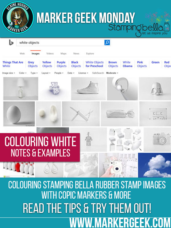
Today we’re going to take a look at colouring white! I thought it would be fairly useful at this time of year, with all the festive colouring and card-making going on. Click through to read the post.

If you’re looking to do some really fast colouring, and don’t want to add shading and detail, there is always the option of simply leaving the white of the paper to represent white. If however, you want to give your image depth and dimension, you’re going to need to add some colour.
Objects that are “white” aren’t a flat white. They have form and shadows. In fact, if you look at white objects around you, you will see quite a lot of colour.
The colours you choose to shade white areas or objects will depend on the nature of the object and what is surrounding the area or object.
A general rule of thumb that might help:
The depth of the colours you choose may be influenced by the rest of your colouring. If you are colouring using lots of dark colours, particularly in your background, you can make the shading of your white objects darker. The colour of the background and items surrounding or clothing the object or character will create contrast with the white object and help you to see it as being white. It might be helpful to you to leave colouring the white object till last, or to leave the option of returning to the white after colouring other areas to deepen the shading.
BE BRAVE: Try adding just a small amount of a darker colour to your shadow areas, and see how it looks. You may be pleasantly surprised!
I know many of you enjoy them, so I will try and put together a combo cheat sheet for you when I get a moment, but be brave and experiment with those markers!
NOTE: I am referring to Copic Markers here, but you can take the general idea and apply it to any medium that you have. The principles are the same!
TIP: use your 0 Colorless Blender pen to help soften the edges of your shading.
You can have quite a bit of fun with colouring snow. Do an image search online for photos of snowy scenes and see how different lighting and settings affect the colour of the snow. The snow will reflect quite a lot of the colours around it, so if you feel like spending some time playing, try using different light colours in the highlight areas to represent this reflected light.
You can see how I coloured a snowy background in last week’s post: Colouring a Snowy Background using Copic Markers. Here’s the card:
My recent Chickadeer card showed some slightly darker shading on the snow: Easy Winter Background using Copic Markers. Here’s the card:
I could actually have gone darker with the shading on the snowy ground on this one, with the dark sky background.
On my Santa’s Speedy Delivery card, Santa has a couple of different “whites” – the white of his bear and the white trim on his hat. I used different greys to colour each, to separate them and add some visual interest. Easy Northern Lights Effect Background using Copics.
The very simple shading gives a little more form and interest to the scene, rather than just depicting a flat white bank of snow.
On my Christmasgiftabella card I added a really small amount of darker grey to the shadow areas of the dress trim, and to the gift she is holding as the contrast between the white highlight and the red of the dress really helps the trim to “read” as white. The warm yellow toned background really helps too. Christmasgiftabella Copic Pleats & Folds Step by Step Guide.
See how just the really small amount of a darker tone can really help to create depth and interest in the white areas? Try it!
If you try out the techniques shown in any of the posts with your Stamping Bella stamps, be sure to share! We would love to see the results and hear how you feel about them. Show off your creations in the comments below and even better, share your own favourite tips with us. Let’s talk colour!
If you are posting your images online, we would love to see them on Instagram and all the platforms mentioned above. To make it easier for us to find you just use #markergeekmonday and/or #stampingbella as a hashtag. Even better tag me @markergeek and @stampingbella . We love it when you connect, so don’t be shy!
If you’re on Facebook join us in our private chat group Stamping Bella Sistahood to share your creations there and chat all things Stamping Bella related!
Until next time, HAPPY COLOURING!
MWAH
Elaineabella
Comments are closed.
Elaine, thank you so much for this great tutorial!!! Your examples are great and it is so helpful to have this visual that you have included.
Elaine,
First, you’re amazing with a pencil and marker, your coloring is phenomenal, I wanna be like you ?. I read and save all your blog posting, tutorials and videos. I have come to admit to myself that my brain is more analytical and little to no creativity. I will continue to read your posts and copy what you do in hopes that the creative side of my brain will wake up and I can achieve a smidgen of your talent. Thank you so much from the bottom this of a wanna be creative heart for the time and effort you invent with your writing and videos. I truly do appreciate it.
??
Vivian.
Another fabulous Elaine-tutorial!
Christine x
Thanks so much! This is very helpful!
Thanks so much for sharing! As always, a lot of valuable information that we can put to use! 🙂